The script for the Photoshop Advanced Workshop is intended exclusively for use in class at the University of Applied Arts Vienna and should serve as a reference work for all course participants. It may not be passed on to third parties.
Color Mode
Bitmap
If you want to output a halftone image in screen printing, it must be screened in a special way. Screen printing is a printing technique where a mesh is used to transfer ink onto a substrate. The quality of the printed image is determined by the thread count of the mesh. The higher the better.
- Fashion and textile students may have had a hand in screen printing themselves. Screen printing is wonderfully suited for printing on textiles.
- But screen printing still plays an important role in classic graphic design as well. Backlit posters for light boxes and city lights, for example, are still produced using screen printing. Screen printing is the only way to achieve the very high ink density required for backlighting.
- But the screen printing process is also used on curved substrates, e.g. glass and ceramic objects.
We can’t go too deep into this exciting subject in the Photoshop workshop. However, I would like to at least briefly explain the common measures for creating a screen print template in Photoshop and give a few tips. For simplicity’s sake, let’s create a monochrome template.
First, as I said, the halftone image must be screened. In Photoshop, you do this by transferring it to Bitmap mode. The Grayscale mode also acts as an intermediate step this time.
> Revert.
> Image / Mode / Grayscale.
> Image / Mode / Bitmap.
In the bitmap dialog, two parameters are defined first: the resolution and the method for rasterization.
> Resolution: 300 ppi.
Now we choose a method. We use the halftone screen.
> Halftone Screen… and OK.
The Frequency must of course be matched to the screen mesh you want to use for printing. The ideal value can be easily calculated with a simple formula: Threads per inch divided by 4.5 gives the optimum lines/inch value.
Screen Printing Formulas

For example, if you want to use a 60T screen, calculate as follows: 60 lpcm x 2.54 : 4.5 = 33 lines/inch.
> Frequency: 33 lines/inch.
The value for the Angle is of rather little importance for a monochrome original. In any case, you should choose something not too “normal”.
> Angle: 22.5 (= half of 45°).
For four-color printing, the following screen angle scheme is considered ideal: Cyan 15° / Magenta 45° / Yellow 75° / Black 135°.
We choose the diamond as the Point Shape.
> Shape: Diamond.
But you could also choose any other shape.
Mind you: The settings we make here only come into effect when we do the screen printing manually. For industrial production in print shops, for example when producing backlit prints for city lights or other backlit advertising surfaces, we don’t usually have to worry about any of this. Prepress then takes care of that for us.
> OK.
As you can see, a lot of fine details are lost. As a rule of thumb, the thinnest line that can still be printed should be at least 2 to 3 times as thick as the mesh size of the screen.
For our example, this would mean: 60 lpcm corresponds to 6 lpmm, i.e.: 3 x 1/6 mm = 0.5 mm.
Once you have completed the screen conversion, you still have to produce the final artwork or, optionally, the print template.
- For the creation of the final artwork, the bitmap is usually saved as PSD or TIFF and sent to the print shop.
- A print template is output via the print dialog, because the required printer´s marks can be created there. The subject is printed directly onto the foil.
Since the procedure for creating screen printing templates is very individual, depending on the printing process, it is advisable to contact the print shop in advance to ask about the parameters to be used.
Lab Color
> Reset exercise file 2.
Before we can turn to the color management in Photoshop, we have to deal briefly with the Lab mode.
Lab is a color space based on human color perception. Lab is superior to all the other color spaces we encounter in Photoshop, which means that, in a sense, it contains all the other color spaces. The Lab mode represents the CIE color space, which captures all colors that can be perceived by humans and relates them to physical causes, namely the color stimulus.
The Lab mode thus describes what a color looks like, rather than specifying how it is created in a particular device – a monitor, a printer, a digital camera, and so on. The Lab mode is therefore a device-independent color mode that serves as a reference for all color management systems to transform a color from one color space to another.
We now need to familiarize ourselves with a few basic aspects of image processing and delve a little into color theory and color management.
CIE Standard Valence System

What we see here is a two-dimensional schematic representation of the CIE color space (CIE – Commission internationale de l’éclairage, Geneva; 1931). The dimension of brightness is missing in this representation. But I think it can be guessed how we have to imagine a three-dimensional color space.
Let’s quickly familiarize ourselves with the elements of the color scheme.
- At the edge of the color space, the spectral colors appear on the spectral color line in the highest degree of saturation: red > yellow > green > cyan > blue > magenta.
- On the spectral color line, the primary colors RGB and CMY alternate.
- The base line in the diagram is called the purple line. This is a theoretical construction that connects the two extreme ends of the spectrum visible to humans, violet and red. It bends the spectral color line together to form a spectral surface, creating the familiar shoe sole shape. UV and infrared are clearly not represented in this scheme.
- On the black body curve, the colors of thermal radiation sources can be read.
A 900K hot body glows red, between 5000K and 6500K the body glows white, like the daylight of our sun. At even higher temperatures, the bodies then glow bluer. - Each color in the CIE Lab scheme is described on the one hand by the color temperature (b), and on the other hand by the color tint (a).
- The temperature (b) results from the hue and the saturation on the blue-yellow axis.
- The tint (a) results from the hue and the saturation on the green-magenta axis. The values of the red-cyan axis can be omitted in this scheme, since they are defined by the mixture of a and b.
- If we add the brightness (L) as a third dimension, the definition according to Lab is perfect.
Without having come into contact with the Lab mode as such, we have already made important adjustments according to the aspects of this scheme in the workshop. Lab acts in the background, so to speak, and shows itself to us directly in two places in Photoshop: in Camera Raw and in Lab mode.
> Filter / Camera Raw Filter… / Color Panel.
The Camera Raw filter allows us to access the settings we learned about during the Raw conversion in the Photoshop program environment.
- By dragging the Temperature slider we influence hue and saturation on the blue-yellow axis. So the Temperature slider represents the b in Lab.
- By dragging the Tint slider we influence hue and saturation on the green-magenta axis. So the Tint slider represents the a in Lab.
- The cyan-red color can be adjusted by dragging both sliders.
You remember, we modified Temperature and Tint to perform a white balance.
- Approximately in the middle of the CIE scheme is the neutral point W on the black body curve. This is, of course, the white point. It is the point with the lowest saturation. If you draw a connecting line from a point on the spectral color line to W, all the saturation values of a particular hue will appear on this connecting line.
To make a white balance is to set the white point of an image. If you want to create a neutral light situation in the image, similar to daylight, in which all colors appear quasi natural, the white point of the image and the white point of the CIE scheme must coincide. And this is exactly what is achieved by dragging the two sliders for color temperature and color tint.
We modify the L of the Lab scheme, i.e. the brightness, with the Exposure slider and match it with the Contrast, Highlights, Shadows, White and Black sliders in different tonal ranges.
Now let’s make a conversion to Lab mode.
> Cancel Camera Raw filter.
> Image / Mode / Convert to Lab.
As you can see, the colors in the image have not changed with the conversion to Lab. This is because Lab contains all the other color spaces – and thus also the RGB color space we just assumed. In other words, all other color spaces are only subsets of Lab.
> Bring the Channels palette into view.
After the conversion we find the Lab scheme realized in the Channels palette. There is a luminance channel, where the brightness values of the image are located, and two mixed color channels, a for the green-magenta chromaticity (Tint) and b for the blue-yellow chromaticity (Temperature).
> Cmd+3, cmd+4, cmd+5 and again cmd+2.
The only tangible advantage of working in Lab mode is that the tone values and the color values of the image can be modified here completely independently of each other. However, the great significance of Lab for image processing lies in another feature: We remember, the Lab color space serves as a reference color space for the conversion between different color spaces.
The Lab scheme makes sense in the application context mainly for white balance and an exposure correction. As soon as these parameters are perfectly adjusted, one likes to use another, more intuitive scheme for the further settings.
HSL
> Reset exercise file 2 to RGB.
> Filters / Camera Raw Filter… / Color Mixer.
All pixels in Photoshop are, as you know, determined by three aspects: Hue, saturation and luminance (brightness).
Lab and HSL are identical. They differ only in the notation.
- The identifiers of chromaticity a and b from Lab can conveniently also be described as hue and an associated saturation.
- And the luminance aspect, i.e. the L of the Lab scheme, is identical to the L of the HSL scheme.
We made use of the HSL scheme in the context of Raw conversion to modify the hue, saturation and luminance of certain color areas.
Whenever specific colors and tonal values are involved in Photoshop, we like to work in the HSL scheme.
If the image editor always has the color wheel – as a simplified representation of the CIE standard valence chart – and the HSL scheme – as a simplified representation of Lab – in mind, nothing can go wrong with a tone value correction or a color correction. We will practice this in detail in the workshop.
In Camera Raw, in the Color Picker and in the Hue/Saturation… dialog we have direct access to the HSL scheme. In many other dialogs we work with it indirectly.
Color management
Color spaces and color profiles
In the Basics Workshop, we have already dealt a bit with color management and had a look at the color settings. Now we want to deepen the basic knowledge we gained there. Don’t worry, we won’t explore the subject matter down to the last detail. We want to deal with it just enough to meet the common requirements we encounter in image processing practice.
> Edit / Color Settings…
Adobe RGB (1998) vs. sRGB (IEC61966-2.1):
As basic settings we had chosen Europe Prepress 3 here.
> Settings: Europe Prepress 3.
Europe Prepress 3 sets our RGB workspace as Adobe RGB (1998) and our CMYK workspace as Coated FOGRA39 (ISO 12647-2:2004).
These two color spaces are preferred by image editors who frequently prepare images for print output.
Image editors who primarily prepare images for output on the web like to choose Europe Web/Internet 2 instead and use the famous sRGB (IEC61966-2.1) as RGB workspace.
> Settings: Europe Web/Internet 2.
If you place the cursor over a profile entry, the description field shows more information about the specified color space.
> Mouse-over sRGB entry.
> Back to Europe Prepress 3.
> Mouse-over Adobe RGB.
There we learn that sRGB is good for WWW and Adobe RGB is good for images that are to be converted to CMYK for eventual printing.
Adobe RGB and sRGB are two different RGB color spaces. The gamuts of these two color spaces look as follows when plotted in the CIE standard valence system.
Standard valence chart with Adobe RGB, sRGB and Euroscale Coated

You remember: Unlike the higher-level Lab color space, a specific color space contains only those colors that can be output on a specific device. sRGB, as we know from the description, represents the color space of an average CRT monitor.
Adobe RGB, as we see here, is not only larger than sRGB, but it also includes all sRGB colors. And it includes almost all of the colors in the Euroscale Coated color space, which is all of the colors that can be printed in common four-color printing processes. Comparing the three different gamuts, you can clearly see why Adobe RGB is preferable to sRGB as a better starting point for conversion to CMYK.
How the colors of an image are displayed on the monitor depends on several factors, all of which should be taken into account if you want to see the image “correctly” with regard to the intended output target.
- Namely, the color space and calibration of the monitor, …
- the working color space that we have defined once and for all in the color settings, …
- the color profile that is embedded in the image …
- and of course whether the color management is active at all.
You may have noticed that the terms color space and color profile are often used synonymously. This is not quite true: a profile merely describes a color space. But let’s not get hung up on that.
So what exactly does a color profile describe?
Let’s make this concrete using the example of Coated FOGRA39 (ISO 12647-2:2004).
This important Euroscale CMYK color profile reflects the color gamut in printing …
- in the four-color printing process …
- on a sheetfed offset printing press …
- with selected screen rulings between 60 lpcm and 80 lpcm …
- and a total ink coverage of max. 350% …
- on coated or uncoated paper.
In other words: If my CMYK image has the color profile Coated FOGRA39, then I see the image on the perfectly calibrated monitor as it is to be expected as a print result in sheetfed offset printing with the parameters mentioned. And only if I see the image correctly on the monitor can I also process it correctly. So we’re not going to do away with color management at all.
And we will always do a check to see which color profile is embedded in the image we intend to process.
- Documents that are newly created, Photoshop automatically provides them with the color profile set as the working color space in the color settings. Therefore, when we first set up Photoshop on a new workstation, we immediately take care of the color settings.
- Foreign documents opened in Photoshop may have different color profiles. Input profiles like camera or scanner profiles, output profiles like monitor profiles or already any specific print output profiles.
- When opening an image whose embedded profile differs from my defined working color space, Photoshop confronts me with the familiar dialog.
Now let’s take a quick look at a few more common profiles.
ProPhotoRGB:
ProPhotoRGB is of little interest to the practice of a traditional image editor, whether she is preparing her images for print or web. However, photographers may be enthusiastic about this input profile. ProPhotoRGB is slowly starting to replace Adobe RGB in high-end digital cameras.
The color space is significantly larger than that of Adobe RGB and also contains colors that the human eye cannot perceive, i.e. colors that lie outside the CIE shoe. Of course, these so-called imaginary colors do not make sense.
ProPhotoRGB Gammut

But even within the CIE color space, ProPhotoRGB offers significantly more than Adobe RGB. And this can be used in the context of a Raw conversion.
This extensive color space is still not easy to handle in Photoshop. Maintaining the color depth of 16 bits/channel is recommended when working with ProPhotoRGB.
Now the most important output profiles.
ICC profiles
Output profiles are often called ICC profiles (International Color Consortium). ICC profiles are document profiles that refer to a specific printing process with specific printing parameters.
> Info bar: Document Profile.
Let’s enjoy for a last moment the colors of Adobe RGB (1998).
Euroscale Coated in the definition according to Coated FOGRA39 has a limited color space compared to Adobe RGB. A conversion to CMYK will irretrievably delete all colors in the image that lie outside the Coated FOGRA39 gamut.
In order to be able to use the full range of options for image processing, it is advisable to remain in Adobe RGB as long as possible and only convert a copy of the image to CMYK at the very end.
It is often the case that you don’t know the specific target profile at the start of image editing. It may also be that the same image is to be output using different printing processes and therefore different ICC profiles are required. In cases like these, it is even more appropriate to keep the image in the largest possible color space, i.e., Adobe RGB (1998).
In order to be able to take a look into the future, a soft proof is created temporarily.
Proof Colors
> View / Proof Setup / Working CMYK.
> View / Proof Colors and deactivate again.
What you see (RGB), what you get (CMYK).
To use a specific ICC profile for displaying the proof colors, it must be set up beforehand.
> View / Proof Setup / Custom / ISO coated v2 (ECI).
> View / Proof Colors via cmd+Y and deactivate again.
> Cancel Proof Setup.
With the help of the Gamut Warning you can find out which areas will be affected by the expected color drop in the print.
> View / Gamut Warning: cmd+shift+Y.
The RGB view not only makes false promises with regard to a print output, it also tempts the image editor to take the wrong measures.
Let’s now make the separation final.
> View / Mode / CMYK.
> View Info Bar or Info Palette: Document Profiles.
Sheetfed offset profiles
Coated FOGRA39 (ISO 12647-2:2004):
Our image is now displayed on the monitor according to the FOGRA39 (ISO 12647-2:2004) characterization data. The conversion from Adobe RGB to FOGRA39 was done secretly in an intermediate step via the media-neutral Lab.
Characterization data describes a printing condition and is the starting point for creating ICC profiles. Strictly speaking, FOGRA39 is not an ICC profile. However, it can be used as such and is essentially used as a proof standard. So we are absolutely correct in our choice in the color settings.
Characterization data like this is produced for the German-speaking countries by FOGRA (today: Forschungsinstitut für Medientechnologien e.V.; originally: Deutsche Gesellschaft für Forschung im graphischen Gewerbe ).
For this purpose, a color chart consisting of many individual CMYK color swatches is printed in the respective output condition and spectrophotometrically measured. A Lab value is assigned to each CMYK value. The result is an exact description of the specific color space of the output medium.
ICC profiles sheetfed offset

FOGRA39 is state of the art for the output conditions mentioned (sheetfed offset, 350% total ink coverage, etc.). Its predecessor FOGRA27 is no longer in use, its successor FOGRA51 (ISO 12647-2:2013) is already in the starting blocks but is not yet used in the industry for proofing.
We now want to examine a few important ICC profiles and their effects on the display of our image on the monitor.
> Draw a small rectangle selection in the lower right corner of the image.
> Set foreground color as Photoshop deep black by pressing the D key.
> Fill via option-backspace.
> Check the total ink coverage of the black rectangle via the Info palette.
A check of the total ink coverage in the info palette shows that the generated Photoshop deep black is already reduced compared to the maximum permissible total ink coverage of Coated FOGRA 39. However, we can live with this small paternalism, as many sheet-fed offset presses are not able to achieve the potential 350%. With the 330%, we are on the safe side as far as this type of printing is concerned.
> Edit / Convert to Profile / ISO coated v2 (ECI).
> Deactivate Preview and activate it again.
ISO coated v2 (ECI):
The well-known ICC profile ISO coated v2 is based on the characterization data of FOGRA39. Therefore, it is not surprising that the conversion is hardly reflected visually.
ISO coated v2 is the most commonly used profile in the European printing industry. It stands for the most common printing process, sheetfed offset printing on coated or uncoated paper. ISO coated v2 allows a maximum total ink coverage of 330%. However, the separation differs minimally from that of the FOGRA 39 characterization data.
> Check the total ink coverage of the black rectangle via the Info palette.
> Deactivate Preview and activate it again.
What we have learned by the way is that if the correct ICC profile is used and embedded, the maximum permissible total ink coverage for a printing process will never be exceeded. The particular profile itself takes care of that.
Still, we should always keep an eye on the black point and the white point.
- The white point, because we do not want to have large areas in the image that are pure white, i.e. non-printing. This is because at the edge of the non-printing area there will be a fine line of very small printer dots in a gradient. You want to avoid the appearance of this line.
- The black point, because large, black areas within images look washed out when the overall ink coverage is very low. We’ll have to deal with this in the next profile we discuss.
ISO coated v2 300% (ECI):
Also very popular, ISO coated v2 300% (ECI) reduces the maximum allowable total ink coverage to 300%.
> Switch to ISO coated v2 300% (ECI).
> Deactivate Preview and activate it again.
ISO coated v2 300% (ECI) is the little brother of ISO coated v2 (ECI) and is mainly used by online printers. The reduced total ink coverage makes the deepest possible black appear a little flat, but the ink dries faster and the sheets can be fed to postpress more quickly.
PSO Coated v3:
With PSO Coated v3 (Process Standard Offset Printing), based on the new FOGRA51 characterization data for sheetfed offset printing, a successor to ISO coated v2 300% has already been created.
> Change to PSO Coated v3.
> Deactivate Preview and activate it again.
At present, this ICC profile is still rather rarely requested by printers. Its advantage over ISO coated v2 300% (ECI) is that it can be used for a wider range of output devices (including low-end digital printing processes). Image editors are still a bit skeptical about this profile and therefore cautiously wait and see.
Web offset profiles
ICC profiles web offset

The web offset process requires completely different profiles. The decisive factors in web offset printing are the special paper qualities and the reduced total ink coverage.
Up to now, the specifications of FOGRA28 have been used as characterization data for this. However, further developments are also being made in this area. FOGRA28 and its ICC profiles Web Coated FOGRA28 and ISO Web Coated will be replaced in the next few years by profiles such as …
PSO LWC Improved (ECI):
PSO LWC Improved is based on FOGRA45 and meets the requirements of modern web offset printing on LWC (Light Weight Coated) paper. The total ink coverage is 300%.
Newspaper printing profiles
ICC profiles Newspaper printing

ISO Newspaper26v4:
ISO Newspaper26v4 is considered the standard ICC profile for newspaper printing. The requirements in newspaper printing are very specific.
You see, the total ink coverage shrinks to 215%. If you look at the printed image of a daily newspaper, it immediately becomes clear what this means: low ink coverage, flat blacks.
WAN-IFRAnewspaper 26v5:
WAN-IFRAnewspaper 26v5 is the successor of ISO Newspaper26v4.
Admittedly, this all sounds very special and you don’t really have to remember it all down to the last detail. But what matters in each case is to use the right profile for the right printing process.
Profile procurement
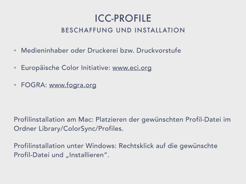
We have just picked out a few important, frequently used ICC profiles from the long list and looked at them.
For many different printing processes, using many different substrates, a suitable ICC profile exists in each case. If we want to prepare our images correctly in Photoshop for the respective output type, we have to take care of obtaining the correct profile in advance of the actual image processing.
Obtaining the required profile:
- The first way is to go to the media owner or the printer or prepress.
- If you do not find what you are looking for at the media owner or print shop, visit the European Color Initiative (ECI) website: www.eci.org > Downloads.
- If you want to find out about the latest developments, check out FOGRA: www.fogra.org.
Installation of the required profile:
- Profile installation on Mac: Placing the required profile file in the Library/ColorSync/Profiles folder. (For students in Computerstudio in User/Library).
- Profile installation on Windows: Right-click on the desired profile file and “Install”.
Profile conversion
Nowadays, images actually always end up on the image editor’s desktop with an embedded color profile. Mostly these are input profiles, i.e. camera profiles and the like. But often output profiles, i.e. ICC profiles, are embedded in the images as well.
It is not uncommon for the image editor to perform a profile conversion as a first measure. In this process, she transfers the image from the source color space, which is determined by the embedded profile, to the desired target color space, which is to be effective during image processing and must finally be embedded in the output file.
In Photoshop, there are two ways to apply a profile to an image: Assign Profile and Convert to Profile.
Both dialogs are located in the Edit menu.
Assign Profile:
> Restore RGB.
> Edit / Assign Profile… and close it again.
If you assign a profile to the image, only the appearance of the image on the monitor is adjusted accordingly. The actual color values of the image remain unchanged. Assign Profile acts more or less as a preview mode during image processing. Advantage: Profile changes can be made without loss.
Convert to Profile:
> Edit / Convert to Profile…
> Remain in dialog.
A profile conversion should only be done when the target profile is finally determined. In the course of the conversion, the color values of the source color space are actually converted to the color values of the target color space.
Rule of thumb: profiles are always only assigned in the master file. A profile conversion is always performed only in a dedicated output file.
Profile conversion RGB:
The conversion from Adobe RGB (1998) to sRGB is very often done in web design and is relatively unproblematic. This is usually done by the web designer directly in the Export dialogs by activating the sRGB checkbox and does not have to be done specifically in the Convert to Profile dialog.
Important note: Since sRGB is the standard color space for every CSS (Cascading Style Sheets), RGB colors in Webdsign are understood as sRGB color definitions. To be able to work with exact color values throughout the entire web design workflow, the web designer should therefore already create the master file in sRGB mode. The sRGB checkbox in the export dialog can then be ignored. Where exact color values are not important, the master can be kept in Adobe RGB (1998). The sRGB appearance can then be simulated by simply assigning the profile.
However, if the target color space is larger or significantly larger than the source color space, as is the case when converting from sRGB to Adobe RGB (1998), this can lead to undesirable effects in the image. Often the dreaded banding appears in certain gradients.
The Use Dither option can mitigate banding and should therefore always be activated.
Pro tip: It is recommended to up-resample the image to 16-bit/channel mode before profile conversion.
This will not increase the defacto bit depth of the image, but during the profile conversion process Photoshop can work with 65535 tonal values per channel and not just the 256 gradations of the 8 bit/channel image.
Profile Conversion CMYK:
Converting from one ICC profile to another can also bring unwanted effects. The small detour via the temporary increase of the color depth to 16 bits/channel is also advantageous here. In addition to the conversion of the color values, the white point is also recalculated during the profile conversion. This should therefore be checked again after the conversion.
In the conversion options of the Convert to Profile dialog we can first choose between two different color management modules. We activate there either the Adobe Color Engine (ACE) or the Apple Color Management Module (CMM).
I haven’t had any negative experiences with the Adobe Color Engine so far, so I use it by default.
For the conversion, the so-called gamut mapping, we can choose between four rendering intents, i.e. conversion methods:
- Absolute Colorimetric: All colors are transferred unchanged to the target color space. However, colors that lie outside the target color space are clipped (gamut clipping). This conversion method is the only one that is colorimetrically exact, but because of its rigidity it is only used when exact color values are to be proofed.
- Relative Colorimetric: Is the default setting in Photoshop. This conversion method works like Absolute Colorimetric, but adjusts the white balance to the target color space. This results in some color shifts and brightness changes, but usually gives the best conversion results.
- Perceptual: Retains the relative color differences, color fidelity and saturation are secondary. The color differences in the details are largely preserved, but the colors sometimes dull a little. This method is chosen when the overall impression of the image is to be preserved and color fidelity is not so important.
- Saturation: Works like Perceptive, but tries to preserve saturation as much as possible. This method is more suitable for illus than for classic photos.
For the vast majority of profile conversion tasks in classic image processing, we resort to the Relative Colorimetric render priority.
The Use Black Point Compensation option improves the rendering of detail in the shadows and should always be enabled.
In addition to color management, there are other important aspects that ensure color reliability.
Monitor calibration
As a general rule, laptop monitors and glossy displays are unsuitable for image editing. Why? Because of the unavoidable reflections.
Monitor calibration and ambient light also play an important role in image processing, of course. Perfect profile or not, if the monitor is poorly calibrated or the workstation is located in a light-flooded office room, you cannot expect to see properly.
The most important parameters that need to be set correctly as part of a monitor calibration are …
- the overall brightness,
- the contrast,
- the gamma value, i.e. the brightness of the midtones,
- as well as the white point and the color temperature.
Of course, a real monitor calibration can only be performed for a high-end display. Inexpensive displays or laptop displays can at least be adjusted with a soft calibration.
The setting options offered by the monitors in the computer studio are very limited. This is also due to the fact that we are not sitting in front of any high-end image editing displays here, but rather devices for everyday graphic use.
Professional image editors calibrate their monitors at least once a month, using a colorimeter and sophisticated analysis software.
Conclusion
So, can we not make professional tonal and color corrections in Photoshop at all if one of the numerous conditions mentioned above is not met?
Actually, unfortunately, yes.
However, if we take care to create the best possible conditions for our image processing and always reach for the correct ICC profile, then at least we can’t go completely wrong with our image processing measures.
If we want to hedge further, we also have two options.
- The production of a color-accurate proof by a professional image processing studio, which we can use to check our own image processing results.
- The transfer of complex, print-specific processing to a professional image processing studio.
Now that we have learned the most important basic concepts of color theory and color management in the appropriate application contexts, we can finally start editing images.
> Open exercise file 3.
Area selection
We have already learned numerous selection techniques in the Basic workshop and want to further improve our skills in this important area.
Different selection goals require the mastery of different selection techniques. For the creation of area selections, we can make use of the simple area selection tools of the toolbox, for example: Rectangular Marquee Tool, Ellipse Marquee Tool, the Lasso Tools.
Area Section Tools
Areas that have complex contours can’t really be captured well with these simple tools.
However, we have already learned about more complex area selection techniques that involve alpha channels or mask creation. The convenient Quick Mask Mode, for example, which allows you to brush area selections with an appropriate painting tool.
> Activate Quick Mask Mode (Q).
> Select the “Chalk 2 (50px)” brush and make a few brushstrokes.
> Deactivate Quick Mask Mode (Q).
> Deselect.
But this extremely convenient technique has its limits, namely where the contours of the area to be selected are as complex as in our example. Of course, precise selection creation is not possible with this technique.
It is clear that in this particular case the selection can only be made by capturing the color or tonal value differences. Applications with AI support promise more success here. These include the Object Selection Tool and the Quick Selection Tool.
Let’s try the Object Selection Tool first.
> Object Selection Tool: Deactivate Hard Edge. Click Selection Preview.
> Copy layer via cmd+J.
> Layer name: “via Object Selection Tool.”
> Create new layer via cmd-click the Create New Layer button.
> Fill area with white (D, X) via Option+Backspace, layer name: “Background.”
The result is at least not completely unusable. But we can’t be satisfied with it.
Maybe it will work better with the Quick Selection Tool.
> Hide layer, switch to background layer.
> Quick Selection Tool: Round soft, approx. 70 Px.
> Select motif as good as possible by adding and subtracting (alt) and cmd+J.
> Place in front of white background.
> Layer name: “via Quick Selection Tool”.
As you can see, this approach also produces a less than satisfactory result.
Let’s try the handy Select Subject function. To use this feature, we don’t necessarily have to consult the Selection menu, but can also activate it directly in the options bar of the Quick Selection Tool.
> Hide layer, switch to background layer.
> Activate Quick Selection Tool / Options bar: Select Subject (Device) and cmd+J.
> Place layer above the white background.
> Layer name: “via Select Subject (Device)”.
The result is quite impressive. We may even be able to do better if we outsource the computing process to the cloud.
> Hide layer, switch to background layer.
> Activate Quick Selection Tool / Options bar: Select Subject (Cloud) and cmd+J.
> Place layer above the white background.
> Layer name: “via Select Subject (Cloud)”.
Only via Cloud the AI support takes effect to the full extent. In any case, I recommend outsourcing the calculation to the cloud. To make this option permanent, we need to make a very specific setting in the Preferences. We have already viewed this.
> Photoshop / Preferences / Image Processing.
Color channel selection
Creating selections with AI support doesn’t always work so smoothly. So let’s take a look at how we can do this using our human abilities.
Let’s now try it with a tone value mask. This is a technique that is as simple as it is promising. A look at the color channels shows where the tonal separation between the subject and the background is more or less pronounced.
Naturally, the aim is to use the greatest tonal value difference. In which channel does the cat stand out best from the background?
> Cmd+3, cmd+4, cmd+5.
The example doesn’t make it easy for us. I would say in this case there is not too much difference. Let’s use the blue channel to create a mask.
> Duplicate Blue Channel.
If we duplicate the blue channel, we get a new alpha channel that contains exactly the tonal values of the blue channel.
Now we need to increase the contrast in the channel so that the cat zone appears black and the background white. We proceed carefully and start by increasing the contrast with the help of a Curve.
> Image / Adjustments / Curves… (cmd+M).
> Activate On-image adjustment tool / raise highlights for background.
> On-image adjustment tool / Lower darker tones (cat cheek left).
We observe only the hairy edge during the contrast increase. There we want to achieve a good tonal separation.
In a second step, we push the dark and the light areas even further.
> Image / Adjustments / Levels… (cmd+L).
We achieve this by setting a white point and a black point using the corresponding tools and/or by dragging the White slider and the Black slider.
> Use Set Black Point Eyedropper Tool and Set White Point Eyedropper Tool.
> Finetuning with the two sliders.
By manipulating the Gamma slider, we determine which midtones are included in the selection and which are not. We always observe the edge area of the mask.
> Drag the Gamma slider if necessary and OK.
Now we complete the mask. With the lasso and a soft brush we add the clearly localizable inner areas.
> Select the inner areas with the lasso.
> Fill area with black.
> Brush Size 150px, Hardness 0%.
> Apply black in the border areas left and right.
Since in alpha channels the masked areas are marked by color, we still have to invert the tone values to get a real mask. We could do this by inverting the selection. But I always do it right in the channel itself.
> Image / Adjustments / Inverse (cmd+I).
> Load selection via cmd-click Channel.
Switch to the layer palette.
> Duplicate background layer.
> Place in front of white background.
> Convert selection to layer mask by pressing the Add layer mask button.
> Layer name: “via color channel mask”.
If we have worked carefully during the mask creation, the selection can be quite respectable. If the creation of the selection promises to be complex, it is usually worth taking a look at the color channels.
However, Photoshop offers us another, completely different, approach to creating a complex selection.
Select and Mask
The high-end tool for such tasks is given to us with Select and Mask.
We can open the dialog in the Select menu or directly in the options bars of the selection tools of the toolbox. The entry appears there not only for the color selection tools, but also for the simple area selection tools.
> Activate Lasso Tool.
> Options bar: Press Select and Mask…
Clicking the Select and Mask button opens an extensive dialog that we will now explore in more detail.
On the left we have access to a few tools, on the right we can make numerous settings in a kind of palette to improve or output the selection result.
Let’s first set the view to Onion Skin.
> View Mode / View / Onion Skin (O).
This view mode is quite suitable to control what is selected in the image and what is not. What is 100% selected is shown completely, everything else in a kind of ghost effect, whose strength we can set with the Transparency slider.
> Transparency 25%.
We can now access one of the tools provided for this purpose to create the selection. In addition to the Quick Selection Tool, the toolbox offers a Brush Tool and an Object Selection Tool for manual selection. Before we get to work ourselves, let’s take a look at what the AI provides us with. So we press the Select Subject button.
> Press the Select Subject button.
The result is roughly the same as the one we achieved before. In this respect, the Select and Mask dialog has nothing over the direct application. So what are the reasons why we like to use the dialog for complex range selection tasks?
The advantages of the Select and Mask dialog are, in short, the tools and features for refining selections and the visual control options it offers us.
Refine Hair is just crying out to be activated, but does not always bring the hoped-for improvements.
> Press the Refine Hair button.
> Press the Reset the Workspace button.
In this case, we should try to achieve the improvement manually. To do this, we use the Refine Edge Brush tool.
> Press the Select Subject button again.
> Refine Edge Brush Tool (R) 300px, hardness 0%.
> Brush along the outside of the subject.
This already looks quite good. Let’s check it by switching to the Overlay view.
> View Mode / View / Overlay (V).
The masked areas now appear in red mask color. We can see that the Refine Edge Brush Tool had difficulty hitting the right contours in some areas. Let’s counteract this with the Quick Selection Tool.
> Quick Selection Tool 200px.
> Paint the inside of the cat and remove any overshooting via the Option key to remove it.
In this dialog we use the brush tool as we are used to in the Quick Mask Mode. Open mask or close mask via Option key.
> Brush Tool 2px, hardness 90%, spacing 15%.
> Add whiskers to the selection.
Now let’s check the quality of our clipping and take a look at the mask itself. The classic mask view allows us to edit the mask as we are used to from the alpha channels, from the quick mask mode and from the layer masks.
> View Mode / View / Black & White (K).
> Improve the mask with the Brush Tool.
Now let’s look at the preliminary result on a white background.
> View Mode / View / On White (T).
> 100% Opacity.
This is not bad. Now let’s do the counter test on a black background.
> View Mode / View / On Black (A).
A slight ghosting effect can be seen in the contour area.
The adjustments available in the panel on the right are used to eliminate such unwanted effects. Since our mask already looks quite good, a cautious approach is advised here.
Let’s first try out whether the selection edge can be improved if we switch from Color Aware to Object Aware mode.
> Activate Object Aware and deactivate it again.
Since the hairy outline of the subject is not a compact boundary, we fare better with Color Aware.
> Pull Edge Detection all the way to the right.
> Activate Smart Radius.
Smart Radius automatically adjusts the radius for hard and soft edges. So Smart Radius makes no sense if the edges are either hard or soft.
Since we’ve already done a pretty good job with edge detection in general, we don’t need to push it any further, and we also set Edge Detection back to 0.
In our example, we have also already gone beyond the global improvements Smooth, Feather and Contrast.
> Try Smooth, Feather and Contrast and set them back to 0.
With the Shift Edge slider we can move the selection edge inward or outward. This is also a good way to exclude color contamination in the edge area from the selection. Since our selection area is chosen precisely enough, we refrain from moving the edge and resort to another editing option.
The unwanted ghosting effect in the contour area of the motif can sometimes be eliminated quite well with the Decontaminate Color feature.
> Activate Decontaminate Color / Strength 100%.
Photoshop analyzes the chromaticity of the outer selection zones and fills them with a color that matches the subject. The strength of the decontamination should be chosen carefully. Sometimes the edge area has to be shifted to get an acceptable result.
> Decontaminate Color / Strength 50%.
A final check …
> View Mode / View / Black & White (K).
> View Mode / View / On White (T).
Finally we set the output parameters. With color decontamination enabled, the Selection and Layer Mask entries are not available. We choose New Layer with Layer Mask anyway, to be able to fine-tune the clipping in the layer mask if necessary.
> Output to: New Layer with Layer Mask and OK.
> Place in front of a white background.
> Layer name: “via Select and Mask”.
We have perfectly clipped the complex subject and can be satisfied with the result. Theoretically, we should now be able to place the clipping in front of any background without any problems. In practice, however, changing backgrounds sometimes reveal a few unsightly souvenirs here and there. Did we leave the Select and Mask dialog too early? Not necessarily, because we can always make use of its settings and tools again by editing the properties of the layer mask.
Edit layer masks
> Expand Properties palette.
> Activate Layer Mask Thumbnail.
> Modify Density and reset it again.
> Modify Feather and reset it again.
The two sliders Density and Feather are self-explanatory. We don’t need them to improve our current mask any more than we need Color Range.
> Select and Mask…
Pressing the Select and Mask… button brings us back to the Select and Mask dialog. Of course we don’t find our original settings here anymore. But we can use the usual tools and settings to fine-tune the layer mask.
> Cancel.
At the bottom of the Properties palette we find a few more interesting buttons.
> Load Selection from Mask and cmd+D.
Of course we can also activate the selection via cmd-click of the layer mask thumbnail.
> Apply Mask and cmd+Z.
> Delete Mask and cmd+Z.
As you know, we are also faced with the decision whether to apply or delete the mask the moment we drag and drop the mask onto the trash icon of the layer palette.
> Drag mask to the trash icon of the layer palette and cancel.
> Disable/Enable Mask.
We can disable or enable the mask by repeatedly pressing the corresponding button of the Properties palette. By the way, the same can be achieved if we click the layer mask thumbnail of the layers palette while holding down the Shift key.
> Disable/enable mask with Shift key.
Creating an area selection or generating a clipping should no longer be a big problem for us with the techniques we have learned, even for complex tasks.
Of course, the perfect selection goal cannot always be achieved as quickly and easily as in our example. But with the necessary dedication and a little ingenuity, success is inevitable.
We don’t always have to resort to the very extensive Select and Mask dialog. Simple and clearly graspable motifs can be captured much more quickly with the Lasso, the Object Selection Tool, the Quick Selection Tool or with the use of a brush in Quick Mask Mode. If I capture my quick selection in the form of a layer mask, I can always fine-tune it later via Select and Mask.
As with so many image editing tasks, you always have to find a good balance between speed and perfection when creating selections. Not every single pixel is worth my attention if it’s hidden in general noise or some fuzziness.
But there are other selection goals besides clipping, that is, creating area selections, and we’ll turn to those now. What are they?
The three most important are: Color, Luminance and Edges.
> Open exercise file 4.
Color selection
The creation of a color selection can be done with the Magic Wand Tool or in a more controllable way with the Color Range dialog.
We have already learned about both possibilities in the Basics Workshop. Therefore, as a reminder, I will only take a brief look at the Color Range dialog.
Color Range
The magenta tones of the flower are to be recolored. To exclude the magenta and red tones of all other image areas from the manipulation, it is recommended to create an area selection as a starting point for the color selection.
> Quick Selection Tool 100px, hardness 0%.
> Improve selection edges manually.
> Open Select / Color Range…
> Select: first Reds, then Magentas.
> Select: Sampled Colors.
The menu entries Reds and Magentas do not lead to the desired color selection, so we define the target color tones manually using Sampled Colors.
> Activate Localized Color Clusters, Range: 100% / Selection, Preview: non.
- Localized Color Clusters improves the result of manual color definition, if several color ranges are to be included in the selection. This is usually a good option.
- Using the Range slider we limit the zone in which the colors should be selected. At a value of 100%, all similar magenta tones are included in the color selection. As we decrease the Range value, we limit the color selection more and more to areas contiguous to the clicked pixel.
Of course, the current preview does not show a valid scenario because it is based on the last settings we made. Let’s now set a first selection step.
The procedure should be familiar: Using the eyedroppers, we gradually pick up the colors we want to select. The Fuzziness slider is used to fine-tune the result.
> Fuzziness 100.
> Click into a zone with intense magenta tones.
All the magenta tones that have a certain similarity with respect to the clicked reference color are now marked white or light gray in the preview.
We want to include not only the most intense magenta tones in our color selection, but also the most mellow ones. That’s why we use the Plus Eyedropper or activate the Add function by holding down the shift key.
> Add color ranges by Shift-clicking and Shift-dragging.
To check if we really hit all targeted colors, we switch the Selection Preview to Quick Mask.
> Selection Preview: Quick Mask.
> Add more color ranges if necessary.
When we have reached a nearly satisfactory preview, we adjust the result with the Fuzziness slider but.
> Fuzziness 70.
If necessary, we add further color ranges or exclude color ranges from the selection with the Minus Eyedropper or with option key clicks. In any case, we play the game by using the eyedropper and dragging the fuzziness slider until we are sure that we have reached the selection goal.
> Last OK.
> Adjustment layer Hue/Saturation: Activate Colorize / Hue +70 / Saturation +30.
Since we have turned the color selection into a layer mask by selecting an adjustment layer, we can further refine it by editing this layer mask.
> Activate layer mask and refine it with the Brush Tool if necessary.
Whatever we subsequently apply to this color selection, whether a colorization, an increase or decrease in saturation, a darkening or lightening, we can be sure that only the intentional colors are affected by the manipulation and no hues beyond that.
> Open exercise file 5.
Luminance selection
In addition to area and color, tonal values, i.e. brightness levels, can also be targeted. For example, if you want to increase the contrast of the dark rock formations in the foreground and middle ground of the image in order to create more plasticity there, you can use a luminance mask to protect the light zones, i.e. the clouds, from intervention.
Luminance Mask type 1
The creation of a luminance mask is very simple.
> Cmd+A, cmd+C.
> New channel, cmd+V.
Finished is the luminance mask. The tone values of the image itself provide the first type of a luminance mask. Let’s remember the properties of an alpha channel: if you load a selection from a channel, the light areas will be more selected than the dark ones. White provides a 100% selection, black means complete exclusion from the selection.
Strictly speaking, in the current state of our luminance mask, the dark parts of the image will be masked, whereas the light parts will be strongly selected after loading the selection. However, we are aiming for the opposite situation. The dark areas should be more strongly selected and the bright areas less strongly. We ignore this circumstance for now.
However, not only the tonal values of the entire image can be used to create a luminance mask, sometimes it is appropriate to use the tonal values of a color channel. This is always the case when the desired tone separation, i.e. the contrast, is more pronounced in a color channel than in the composite image. We already know the principle from the corresponding selection technique.
In any case, by using a luminance mask, we make the selected brightness levels of the image receptive to subsequent processing. Let’s take a closer look.
> Load selection by command-clicking on the new channel bar.
> Activate composite channel and switch to the layer palette.
> Create adjustment layer Curves.
The active selection is converted to a layer mask as usual. The layer mask now masks the adjustment effect, taking into account the tonal values of the image.
> Pull strongly on the curve: Lighten/Darken.
You can clearly see that the light areas of the image are affected more quickly and more strongly by the correction than the dark areas. So the effect of the adjustment layer is not applied evenly, but to different degrees to different tone levels.
What can be used for brightening or darkening naturally also applies to color correction.
> Curve: Blue channel.
> White point 230/255.
The lighter blue tones of the sky and the clouds are caught more quickly by the correction and are more affected by it than the darker blue tones of the color perspective in the rock massif of the middle ground.
We want to increase the contrast in the darker parts of the image. So let’s reset the curves.
> Activate layer mask thumbnail and expand Properties palette.
> Invert.
By pressing the Invert button we reverse the tone values in the mask. Now the light areas in the image are more masked and the dark areas are more receptive to subsequent processing.
> Activate the Curves button in the Properties palette.
> Curves: Contrast increase 50/45 and 200/230.
Strength and spread of the effect can be fine-tuned by subsequent editing of the layer mask. By dragging the Density slider, I can extend the effect to tonal value areas that have been left out so far.
> Drag the Density slider to the left and set it back to 100%.
The Select and Mask dialog is also sometimes useful for specifying the areas where the effect should be applied. However, we want to process the mask using a different technique. Let’s take a look at the current state of our luminance mask.
> Option-Kick on the layer mask thumbnail.
If we want to extend the contrast increase to the midtone range, the midtones in the mask must be lightened. And we do this, for example, by applying a tone value correction directly to the mask content.
> Open the Levels dialog via cmd+L.
Now we make it very easy for ourselves and use the Set White Point Eyedropper Tool.
> Set the white point in the light gray debris avalanche (center of the image): ca. 175.
Of course, the correction can be controlled better if we have the image in view during the process.
> Cancel and Option-click the layer mask thumbnail again.
> Open Levels dialog via cmd+L.
> Set white point with eyedropper or by dragging the white slider to 175 and OK.
> Before/After by hiding and showing the adjustment layer.
> Finally, hide the adjustment layer.
Luminance Mask type 2
Some tools and dialogs offer the possibility to edit highlights, midtones and shadows separately. Where this option is not available, we can still take advantage of it by creating three luminance masks, each making the highlights, midtones and shadows separately accessible.
To create a Luminance Mask Type 2, we use the Highlights, Midtones and Shadows entries of the Select menu in the Color Range dialog.
> Activate background layer.
> Select / Color Range… / Select menu: Select Highlights.
With the help of the two sliders, the targeted tonal value range can be defined even more precisely. Let’s switch to the Quick Mask preview first, so that we can visually check the selection process.
> Selection Preview: Quick Mask.
> Fuzziness 20%, Range 95 and OK.
> Adjustment layer Curves: Set blue channel point at 120/140.
In the same way, we now create the luminance masks for the midtones and highlights.
> Activate background layer.
> Select / Color Range… / Select menu: Select Midtones.
> Fuzziness 30%, Range 70/150 and OK.
> Adjustment layer Curves: Set RGB points at 60/50 and 200/210.
> Layer blending mode: Luminosity.
By selecting the layer blending mode Luminosity we ensure that the correction is actually applied only to the tonal values of the image and that the color values are spared.
> Activate background layer.
> Select / Color Range… / Select menu: Select Shadows.
> Fuzziness 20%, Range 70 and OK.
> Adjustment layer Hue/Saturation: Hue +15, Saturation +15.
> Layer blending mode: Color.
By selecting the layer blending mode Color we make sure that the correction is applied only to the color values of the image and the tonal values are spared.
I think it’s clear by now what a powerful tool luminance masks are in image processing.
With the help of a luminance mask, corrections can be applied differentially to different brightness levels of the image. Every conceivable intervention, every tool becomes a precision instrument through the use of a luminance mask.
Edge selection
We will now look at another important selection target: the edges of the image. Contours or edges are generally defined as contrast in the image, i.e. those places where lighter pixels meet darker pixels.
> Open exercise file 6.
Edge mask
Since we want to do our editing non-destructively, we duplicate the background layer and convert the duplicate to a Smart Object.
> Duplicate background layer, smart object.
The starting point for creating an edge mask is always a luminance mask.
We can create a luminance mask of type 1 in the way shown earlier, or we can make it even easier.
> Cmd-option+2 (#2 = composite channel).
The tonal values of the image are now active as selection. The shortcut saves us the detour via the channels palette. If we now convert the tone value selection into a layer mask, our luminance mask is created. If you hold down the Option key while creating the layer mask, the tonal values are reversed at the same time.
> Option-click Add layer mask button.
Now we convert the luminance mask to an edge mask. This process is also very simple.
> Bring the layer mask to view.
> Filter / Stylize / Find Edges.
Photoshop marks all contrasts, i.e. all edges, of the image by dark pixels and all homogeneous zones by light pixels. We are on a good way, but we can still be satisfied with the result. The edges are not yet sufficiently pronounced and in the inner areas the smallest contrast jumps show up as noise. So we have to improve the edge mask even more.
> Image / Adjustments / Threshold: 200.
With the Threshold slider we determine which tonal values are set to white and which to black. The tonal values to the right of the threshold slider become white, the tonal values to the left of the threshold slider become black.
Finally, we need to remove the unwanted pixels in the inner areas and soften the mask a bit. After all, we don’t want to leave any processing traces in the application.
> Filter / Noise / Dust & Scratches: 1/0.
> Brush scattered pixels white (optional).
> Filter / Blur / Gaussian Blur 2 Px.
> Image / Adjustments / Levels: Black slider to 100 (optional).
Finished is the edge mask. The contours defined in the edge mask are excluded from any subsequent processing. And this raises the question, what is this good for?
To answer the question, you need to know that sharpness is located in the edges of the image. Sharpness is contrast in the edge area.
If I want to reduce the noise in our image, I have to blur the image or smooth it in some other way. If the image is softened as a whole, the sharpness of the image is lost at the same time as the noise is removed. To demonstrate …
> Deactivate layer mask with Shift-click.
> Filter / Blur / Gaussian Blur 3 Px and cancel.
The edge mask, on the other hand, allows a differentiated application. It protects the image sharpness and makes only the homogeneous inner areas accessible for editing.
> Activate the layer mask again by clicking on the thumbnail.
> Activate layer thumbnail.
> Filter / Blur / Gaussian Blur: try different strength levels, last: 3 Px.
Inner area mask
The beauty of this is that with the edge mask its opposite is given at the same time. All we have to do is invert the tonal values of the layer mask and we can take advantage of an inner area mask.
> Duplicate layer with edge mask with right click.
> Activate the upper layer.
> Delete smart filter with right click.
> Activate layer mask and invert via cmd+I.
Now the edges in the image are accessible for editing and the inner areas are excluded.
> Activate layer thumbnail.
> Filter / Sharpen / Unsharp Mask: 100 / 1 / 0.
> Focus on blowflower edge, Preview 300%.
The preview in the dialog shows quite clearly what would happen in the image if we sharpened it throughout. As the sharpness increases, the noise in the homogeneous inner areas would also increase.
In the image, on the other hand, you can see what our mask does. The dandelion is sharpened and the homogeneous sky is excluded from the sharpening.
> Deactivate Preview and activate it again.
Edge masks are used very often in image processing. Some dialogs even work with built-in edge masks. If you want to fine-tune the masking for precise application, you create the edge masks by hand, of course.
Focus Area
Hidden in the Selection menu is a dialog that looks for edges, i.e. areas of sharpness in the image, to create the selection. What sounds like an edge mask at first, turns out to be a tool for subject selection on closer inspection. The performance of a real edge mask cannot be achieved with Focus Area.
> Hide all layers with Option-click on the view icon of the background layer.
> Activate background layer.
> Open Select / Focus Area.
> View: On White, both parameters: automatic.
We can use the two Parameter sliders to narrow down the focus area. In the workshop, we’ll just use the setting that Photoshop automatically suggests.
In any case, our example clearly shows the difference to a real contour mask. Focus area… does not target sharpness itself, but rather motifs that lie within the sharpness range and attempts to generate a range selection from them.
The sharp areas in the image appear selected in the preview. However, the dialog has problems finding the very complex subject boundaries. This can be clearly seen in the selection remnants of the flying seeds.
Let’s improve the selection contour a little in the Select and Mask dialog.
> Press the Select and Mask button in the dialog.
> Improve the dandelion contour with the Refine Edge tool.
> Remove the seed selection with the Brush tool while holding down the Option key and click OK.
Finally, we set the output option.
> Output: New Layer with Layer Mask, activate Soften Edge and click OK.
Conclusion: Focus Area provides good groundwork for the more complex Select and Mask operation when we want to select a subject via its image sharpness.
Let’s use the selection created in this way to increase the contrast in the subject, for example.
> Activate Select and Mask layer.
> Show background layer, hide all other layers.
> Adjustment layer Curves: contrast increase 60/40 and 200/220.
> Create intersection with the adjustment layer via Option-Click layer separator.
> Blending Mode: Luminosity.
I think we don’t need to talk about the function of the intersection, in the Advanced Workshop. This should already be familiar.
Advanced painting options
Color is an important topic in Photoshop in many ways. We will talk extensively about color manipulation and color correction later. But we also have to deal with the possibilities to bring color as such into the image.
> New document / Print / A4 landscape / 300dpi / Adobe RGB (1998).
> Activate Brush Tool and expand Brushes palette.
Basic functions
We already got to know the Painting Tool and related tools in the Basics Workshop. The Painting or Brush Tool in particular is a versatile, flexible and powerful tool in the hands of the image editor. For the tasks of classic image editing as well as for painting and illustration.
If you are interested in illustration and photoshop art, you can’t avoid an intensive examination of the Brush Tool. It would take a workshop of its own to explore the possibilities offered by the painting tools only halfway.
An indispensable prerequisite for making progress in this area is working with the pen tablet. Since we cannot use the functions of the pen tablet here in the workshop and do not have the necessary time to delve deeper into this exciting subject, we will limit ourselves to illuminating the specific use of the brush in the context of classic image editing tasks.
We do not want to go into the basic brush functions again now. Nevertheless, let’s try to briefly review what we know.
We grab a tool tip from the Brushes palette. The Brushes palette shows the default tool tip set. In the palette menu we can add more tool tip sets.
> Briefly open the Brushes palette menu and close it again.
We activate the standard round soft tool tip.
> Round soft tool tip, size 30 px.
> Horizontal straight stroke and vertical straight stroke by holding down the Shift key.
> Diagonal straight stroke by Shift-clicking.
Adjusting the tool tip:
We modify the selected tool tip in the Brush Settings palette.
> Switch to the Brush Settings palette.
> Adjust Size and Hardness and apply.
The two parameters Size and Hardness can also be modified via right-click in the corresponding context menu.
> Right-click: Adjust size and hardness and apply.
Of course, this can be done more quickly and with a visual control option using two important key shortcuts.
> Crtl-option-drag (Windows: Control-option-right-click) to the right or left: Increase or decrease tool tip size.
> Create brush stroke.
> Crtl-option-drag up or down: Decrease hardness or increase hardness.
> Create brush stroke.
Here is another useful keyboard shortcut: the arrow keys can be used to rotate the tool tip. Rotate in a clockwise direction using the right arrow, rotate against the clockwise direction using the left arrow. Holding down the Shift key while doing this will rotate the tool tip in 15° increments.
> Press the right arrow multiple times.
> Press the left arrow multiple times while holding down the Shift key.
> Options bar: reset the angle value to zero.
Before we get into some more specific brush settings, let’s take a quick look at the Brush tool options bar.
Painting Modes:
The contents of the Painting Mode menu are familiar. What is available here for the brush is found in many different places in Photoshop.
The painting modes of the brush are only effective on pixels. If you paint into an empty layer, the brush painting modes remain ineffective. In this case we use the blending modes of the layer.
> Color the background layer with any color (e.g. light pink).
> Select any contrasting foreground color (e.g. medium light blue).
> Brushstroke, options bar: Normal mode.
> Brushstroke, options bar: Multiply mode.
> Create new empty layer.
> Brushstroke, options bar: Multiply mode.
> Brushstroke, options bar: Normal mode.
> Layers palette: Multiply mode.
Since I always leave the contents of the background layer untouched and do all brushstrokes exclusively in real layers, the painting modes of the brush tool play a minor role for me.
Opacity:
Opacity, on the other hand, can be controlled via the brush options and independently via the slider in the layers palette.
With the opacity of the brush options you define to which maximum the opacity of the brushstroke is built up.
> Color the background layer white.
> Delete the content of layer 1 via cmd+A and Delete.
> Brush options Opacity 50%, Brushstroke horizontal back and forth.
The value for the brush opacity can be set comfortably with the number keys. If you press two digits in a row, you can also define the units.
> Opacity 100% via key 0.
Always use Pressure for Opacity button:
The Always use Pressure for Opacity button activates the tool defaults that were defined in the Brush Settings under Transfer.
> Activate button, observe Brush Settings Transfer settings box and apply.
This only works with the pen tablet. Of course, you cannot use the Pen Pressure function with the mouse.
> Deactivate button.
> Deactivate Transfer again.
Flow:
The Flow value determines the speed at which color is applied, i.e. color build-up occurs.
The flow value can be set comfortably by shift-pressing the number keys when the brush tool is activated. If two Shift digits are pressed in succession, the units can also be defined.
> Brush options flow 25% via Shift key 25.
> Brushstroke horizontal back and forth.
> Flow 100% via shift+0.
Airbrush mode:
When the Airbrush Mode button is activated, a steadily increasing build-up occurs. This button can be used to remotely activate and deactivate the Build-up function in the brush settings.
> Activate Airbrush Mode button, observe Brush Settings Build-up settings box.
> Brush point and hold mouse button down until the brush build-up is complete.
If the opacity is reduced, the airbrush-like color build up occurs up to the defined maximum.
> Brush options Opacity 50% via shift-digit key(!), since airbrush mode button is active.
> Brush point and keep mouse button pressed until the job is complete.
Let’s reset the settings.
> Opacity 100%, Flow 100%, deactivate airbrush mode button.
Always use Pressure for Size:
The Always use Pressure for Size button activates the tool defaults set in the Brush Settings under Shape Dynamics. Of course, this only works with the pen tablet.
With the mouse, only Fade can be used from the pressure functions. And for this you have to make the setting directly in the Shape Dynamics panel.
> Disable Button(!), Shape Dynamics panel, Size Control: Fade 50 and apply.
Clear Brush Controls:
If you want to reset all current brush settings, i.e. restore the initial situation, select Clear Brush Controls in the Palette menu. This is especially helpful if you get lost in the brush creation and want to reliably make tabula rasa.
> Palette menu: Clear Brush Controls.
Own brushes
In the Brushes palette, in addition to the general tips, we also find a few tool tips that can be used to achieve special painting effects.
> Try out various brushes.
The settings for all of these brushes have been defined in the Brush Settings palette and can be modified there.
Adobe is a little stingy here. The limitation is intended to encourage us to download tool tip sets from the Adobe homepage via Get More Brushes…
Another option for filling up our Brushes palette would be to install the Legacy Brushes.
We’ll refrain from doing that for now and instead start creating our own tool tips.
Before we take a closer look, a quick note: Quite a number of brushes offer additional features that can only be used when working with the pen tablet. There are different types of bristle brushes, hair brushes, chalk, crayon and airbrush-like brushes for which parameters such as pressure, opacity, size, brush pose, rotation, etc. can be set to simulate the effects of the personal or current brush pose. All these features are not available for working with the mouse.
Custom brushes:
If we want to create our own tool tip, we can modify an existing tool tip or create the tool tip ourselves from scratch.
> Set background to white, if necessary; New empty layer via cmd-shift+N.
> Hard circle selection, about 50 mm, fill area with black.
> Soft round brush, size circle selection, dab three times with white into the center.
> New empty layer cmd-shift+N.
> Select / Transform Selection, reduce a little to the top left.
> Move reduced selection eccentrically into the larger circle.
> Foreground color: light gray, brightness 90%
> Fill area with light gray.
> Soft round brush, size circle selection, dab three times with white into the center.
> Select large circle via cmd-click layer thumbnail.
> Edit / Define Brush Preset…: “Bubbles 0”.
> Deselect via cmd-D, hide bubbles layers.
> New empty layer cmd-shift+N.
> Switch to Brush Settings palette, Brush Tip Shape: Spacing 300%, Shape Dynamics: Size Jitter 80%, Scattering: Both Axes, Scattering 1000%, Count 1, Count Jitter 25%.
> Press the Create new brush button at the bottom of the palette: “Bubbles 1”, save without color.
> Foreground color: 100-80-0-0, reduce tool tip size to 60 px.
> Vertical brushstroke from bottom to top.
Even with a few simple measures you can create complex brushes like this one. There are no limits to your inventiveness.
More Brush Settings options:
The remaining brush settings options are briefly mentioned for the sake of completeness.
- Texture: In the Texture panel, textures can be defined for brush application. This allows painting surfaces, i.e. surface structures of paper, to be simulated.
- Dual Brush: A dual brush provides brush strokes using two tips. The second brush texture is applied within the brush stroke of the first brush. The result is effectively the intersection of two tool tips.
- Color Dynamics: Color Dynamics allows us to determine how the color in the stroke changes during application. This makes it possible to create a stroke that transitions from one color to another or that consists of multiple colors.
- Transfer: The transfer brush options determine how the stroke itself changes during application.
- Brush Pose: The Brush Pose setting allows you to simulate something like pen posture effects with the mouse. However, the flexibility in use is completely lacking here. Not an option for me.
- Noise: Adds a diffuse noise to the brush stroke. The effect is best seen when using soft tips. This is sometimes necessary to make the paint application look more natural.
- Wet Edges: Creates a painting effect by dropping the paint application inside the stroke to 50%, whereas the edge zone remains opaque. The effect also simulates the typical squeeze edges that occur with very high brush pressure.
- Smoothing: Creates smoother curves when brushing, therefore always good.
- Protect Texture: Assigns the same pattern and size to all brush presets with texture. So simulates consistent canvas texture when using multiple textured brushes.
I think it has already become clear from this brief foray what an incredible reservoir of painting effects is available for the Brush Tool here.
If you want to explore this world yourself, please also take a look at the other painting tools in the toolbox. For example, there is the Smudge Tool, which can be used to create different smearing and dabbing effects. Or the Mixer Brush Tool, which allows you to simulate color blending effects, as they arise in the wet-on-wet technique. And so on and so forth.
Accurate illustration techniques
We already learned in the Basics workshop how easy it is to use paths for painting. You can draw a complex path with the Pen Tool and then conveniently run a tool tip of your choice along it.
Let’s take a look at some other helpful tricks in the Advanced Workshop that make use of paths, or shape layers and masks, when illustrating.
The following example is a bit more extensive. We want to illustrate a water glass.
Background:
> New document, A4 portrait, Adobe RGB, 300 ppi, background black.
> Vertical and horizontal guide lines in document center.
Glass shape:
> Draw Shape Layer with Rectangle Tool from center: approx. 80 x 160 mm. Color white.
> Show Properties palette, upper corner radii 0 px, lower corner radii 100 px.
> Use the Direct Selection Tool to move the lower corners inwards slightly and symmetrically.
> Layer Style: Gradient Overlay, Blending Mode Normal, Opacity 30%, Gradient Black/White, Style Reflected, Align with Layer, Angle 0°, Scale 100%.
> OK.
Glass Border:
> Duplicate Shape Layer, Opacity 10%, Fill 100%, Blending Mode: Screen. Hide Effects.
> Load shape selection via cmd+click.
> Select / Transform Selection: Reduce a bit and move it up for the glass edge.
> Create Layer Mask and Inverse.
Waterline:
> Create new Layer, Opacity 60%.
> Apply layer mask from inner shape layer by Option-Drag.
> Invert layer mask.
> Brush 10 px, hardness 90%, spacing 15%, Shape Dynamics: Size-Jitter 0%, Control: Fade at 800%.
> Activate layer thumbnail.
> Foreground color white, brush waterline from left to right.
Water Optics:
> Activate selection of glass contents.
> Select / Modify / Contract: 10 Px.
> Take away selection above water level.
> Layer / New Fill Layer / Solid Color: White.
> Layer Opacity 5%, Layer Mask Gaussian Blur 10 Px.
Light Edges:
> New empty layer, opacity 60%. Create layer mask from outer shape layer.
> Brush 10 px, hardness 90%, spacing 15%, disable Shape Dynamics.
> Place a gloss on the upper edge of the glass and in the upper area of the left edge of the glass.
> Layer Blending Mode: Soft Light.
Reflection:
> Create new Layer, Opacity 40%. Apply layer mask from inner shape layer by Option-drag.
> Brush 200 px, Hardness 90%, Spacing 15%.
> Draw a diagonal straight line near and along the left edge of the glass.
> Increase brush size to 400 px.
> Activate the layer mask. Cut off the reflection near the upper edge of the glass and shorten it considerably in the lower part of the glass.
Bubbles:
> Switch to background layer / Create new layer.
> Activate Bubbles-1 brush and set it to 30 Px.
> Paint several bubble streams with white from bottom to top. Erase excess bubbles.
> Create new Layer.
> Set Bubbles-1 brush to 10 Px and brush a few small bubbles above the water level.
With just a mastery of a few basic techniques, illustrating in Photoshop is almost effortless. In our example, we barely created a stroke freehand and instead used numerous, different tools and techniques.
Gradient Tool
When we analyze the objects of image editing, we find that we are always dealing with materials, surface qualities, and lighting effects. The image editor must develop an eye for qualities of the most varied kind in order to be able to produce or edit realistic effects and believable scenery.
An important insight is that in nature we hardly ever have to deal with monochrome color surfaces. Surfaces of objects or backgrounds actually always consist of gradients.
The basic functions of the Gradient Tool should be familiar. Nevertheless, I would like to pick out one point again, which is especially important for reproduction, i.e. for the behavior of gradients in printing.
Smooth gradients:
> New document, DIN A4 landscape, CMYK, 300 ppi, background white.
> Gradient Tool: Deactivate Dither and draw a short, linear gradient (Basics/Reds/Red_07) diagonally.
Some color transitions are problematic. This can be seen partly already in RGB, but especially in CMYK mode. If we zoom in a little, we can see a more or less clear banding. Certain gradients have an unfortunate tendency to banding.
> Zoom in sharply (300%) on the transition to blue.
The reason for this is, among other things, that the number of colors or the bit depth is too low. Images with a higher bit depth will hardly show this problem.
A measure to combat banding can be set before the gradient tool is applied.
> Options bar: activate Dither.
The result is immediately much better, but the banding is still present to a reduced extent. Especially with regard to print output, this simple measure is usually not sufficient.
A first reaction would be to smooth the gradient, i.e. to soften it. But the gradient is already soft. Even more softness does not bring any relief.
So the image editor has to go the opposite way and therefore adds noise to the gradient. This may seem absurd at first, but it produces quite acceptable results.
For this, we naturally use the filter Add Noise.
> Filter / Noise / Add noise: Convert to Smart Object.
> 1 Px, Gaussian distribution, Monochromatic.
> Zoom out to 100%. Toogle last state.
1-2 pixels provides a smoother gradient reproduction at an image resolution of 300 dpi, without being noticeable as noise in the print result.
What the example shows us is that noise is not always our enemy, but that noise can also be quite useful in some use cases.
Metal effect:
Let’s now try to capture the aspects of material, surface quality and lighting effect in a concrete example. Let’s artificially create a surface with the look of brushed steel.
> New document, DIN A4 landscape, RGB, 300 ppi, background white.
We create a neutral starting situation.
> New empty layer, Fill with 50% gray, Convert to Smart Object.
We add contrast.
> Filter / Noise / Add Noise 400 Px, Distribution Gaussian, Check Monochromatic.
We set the direction.
> Filter / Blur / Motion Blur: Angle 0, Distance 80 Px.
With this we have created the material and its typical surface quality.
Now we take care of the light reflections typical for metallic surfaces.
> Layer Style: Gradient Overlay, Gradient Black/White, set several duplicates of black and white alternately, Opacity 30%, activate Dither, Blending Mode: Overlay, Style Linear, Angle 25%.
> Use Scale to stretch the gradient until the look fits and OK.
Finally we increase the intensity, i.e. basically the contrast and set the colors to the typical steel blue.
> Adjustment layer Curves: Black Point 40/0, White Point 205/255.
> Layer / New Fill Layer / Solid Color: 20-10-0-0 / Blending Mode Color / Opacity 50%.
What is true for the illustrator is also true – perhaps even more so – for the image editor: you can only create realistic effects if you know the qualities. Only with conscientious study of the image and attentive analysis can one succeed in recognizing the qualities needed in the image in order to be able to recreate them for one’s own purposes.