The script for the Photoshop Basic Workshop is intended exclusively for use in class at the University of Applied Arts Vienna and should serve as a reference work for all course participants. It may not be passed on to third parties.
Welcome to the Photoshop Basic Workshop. We will explore many specific tools and features of the Adobe Photoshop image editing program in this introductory workshop. We will take a grand tour of the program and try to acquire the techniques whose mastery is necessary to accomplish the most important image editing tasks. Image editing is becoming increasingly important in the world of images we live in, even for those who don’t want to deal with it professionally. The good news is that even with a few basic skills we can meet the increasing demands on our images.
In addition, I would like to introduce you to the world of image editing and its importance in graphic design practice. Last but not least, it’s about getting to know the relevant terms of the program, but also those of the industry, in order to be able to make targeted searches on the web if necessary, or to be able to communicate with the relevant professionals at eye level during the implementation of a design project.
And one thing is clear: knowledge of the essential image editing terms is, of course, also of utmost importance for creating targeted prompts in relevant AI applications, such as Nano Banana, Midjourney, Flux, or even Adobe Firefly.
Introduction
Adobe Photoshop is the image editing software par excellence, and has been since the release of version 1.0 in February 1990. Several times since then, the program has caused major changes in relevant industries.
Think, for example, of the growth of post production in photography and the accompanying major change in the way photographs are taken and what is defined as the shooting objective. The professional photographer today often focuses her setup on the post production of the image. The impression that the finished image is only created on the image editor’s desktop is absolutely accurate these days and has been reinforced once again with the implementation of generative AI.
And lithography itself, formerly a highly complex affair, has become part of desktop publishing and is henceforth manageable to a certain extent even for non-professionals.
Let’s start Photoshop.
> Start Photoshop
Photoshop is part of a bundle that can still be called desktop publishing, using a somewhat old-fashioned term. Photoshop is not a stand-alone solution, although we can find a lot of tools and features in the program that we can use to succeed in other areas, such as working graphically, illustrating or painting, typesetting texts or working with vector objects.
The other two important programs that are used in desktop publishing are, of course, Adobe InDesign and Adobe Illustrator.
InDesign is the typesetting program where quantity text typesetting is done.
Illustrator is the classic illustration program with a vector environment, in which vector objects and illustrations are created.
And Photoshop completes the toolbox, as I said, as the image editing program.
Right at the beginning, I would like to mention another important characteristic of Photoshop within the graphic design workflow:
Photoshop, unlike InDesign and Illustrator, is not an output program, meaning we will never or very rarely create print files directly from Photoshop. If you want to create print-ready files, such as print PDFs, you always reach for Illustrator or InDesign. The role of Photoshop is primarily that of an image supplier for the other two programs.
The specifics of the three desktop publishing programs can also be illuminated in terms of the material that is used in each case.
Accordingly, InDesign is a frame-oriented program, Illustrator is a vector-oriented program, and Photoshop is a pixel-oriented program. These are three completely different worlds that must work together in a perfect graphic design workflow. Each of these three programs has its own special tasks in it. And Photoshop, I want to emphasize again, is the image provider.
New document
To get started, let’s create a new document.
> New File.
New File opens the New dialog. In the menu of the New dialog we find certain areas defined, which offer us very specific document templates for selection.
For example, the last selected presets that we can use again for creating a new document. Or: a selection of typical photo formats, relevant print formats, formats suitable for illustration purposes or for web design. Moreover, different display formats that can be used for responsive design. Even film and video formats are listed here.
We first want to create a simple print document and therefore bring the Print menu into view.
> Activate Print.
Photoshop has a whole range of standard formats for us to choose from here. If we open the “View All Presets” submenu, even more standard formats appear, which the graphic designer likes to use in many cases.
In addition to these standard formats, which are mainly based on the DIN series, Photoshop offers us many more print templates for special applications such as package design, product design and much more.
For now, however, we’ll simply choose DIN A4.
> Activate A4: DIN A4 portrait, 300 ppi, RGB, 8 bit, Background White, Adobe RGB (1998).
Dimensions and Orientation: DIN A4, of course, means 210 x 297 mm. Currently we are dealing with a portrait format. This can be quickly changed to landscape format by pressing the corresponding button.
Image Resolution: The image resolution is measured in pixels per inch, or ppi. The Resolution field here already shows the famous 300 dpi, or ppi, needed for a high-quality print result. I will discuss this special image resolution in detail later in the workshop.
Color Mode and Color Depth: The Color Mode is set to RGB. The color depth is 8 bit/pixel per channel. We will also discuss this in detail later.
Color Profile: And also the color management – an important aspect for the image editor – we ignore for the moment. The entry “Working RGB: Adobe RGB (1998)”, which can be seen in my selection box, will reveal its secret at a later time.
Now let’s finish the document creation by clicking the Create button.
> Press Create.
With a look at the title bar we check the status of the document. The file name is followed by the display size, which I will also explain in more detail.
The numeric input field in the lower left corner of the document window can be used to change the display size.
> Activate the input field and cancel.
In the info field, which is located right next to the input field for the display size, we can read the current file size: 24.9M.
A click on the small triangle in the right area of the info field unfolds a menu that allows to view further key information alternatively.
> Expand info menu and cancel.
Let’s take another look at the title bar. There we can read the current color mode (RGB) as well as the current color depth (8 bit). Two important parameters of every image processing, which we will deal with in detail, as already mentioned.
Let’s look at a few more aspects of the program environment.
The Layers palette, which is placed on my right, currently shows only one layer and that is the Background layer.
If you don’t have the layers palette displayed, you can quickly do this by selecting the appropriate entry in the Window menu.
> Window: Layers.
In the right part of the screen I have access to many other palettes whose contents and tools are of great importance for image processing, such as the Channels, the Paths and the Info palette.
We will deal with the perfect choice of palettes a little later. So don’t panic if it doesn’t look exactly the same as it does to me.
However, it is important to make sure that the Tools palette on the left of the document window is available as a vertical palette. Also, the Tools palette can be activated in the Window menu if it is hidden.
Also the sometimes handy Contextual Task Bar.
> Show Contextual Task Bar if necessary.
The Task Bar has no fixed position, but always appears at the place of action, i.e. near an active selection. Its content is contextual and varies depending on the potential task.
Currently, it has two import buttons and a generate button, as well as a small menu that allows you to set a few options.
The practical thing about the Task Bar is that it sometimes saves you from having to browse through the menus, because it gives direct access to selected menu items.
Disadvantage: The Task Bar always seems to get in the way somehow when viewing the image. Personally, I’m not a fan of this tool and therefore hide it.
But don’t let that put you off, maybe the Task Bar fits better into your personal workflow than into mine.
> Hide Contextual Task Bar.
Basically, creating a new document in Photoshop is of secondary importance. I only ever create a New Document when I am working towards a particular format. A typical case for such a procedure is layouting in Photoshop.
> Close new document.
In the genuine Photoshop workflow, image processing starts with simply opening an image. Let’s take a look at that right at the beginning, too.
To do this, let’s get the exercise data from ownCloud and place it in a very specific folder that we will create within the semester folder.
> Download exercise data from the base.
> Create student folder “Last name PSD basics” inside the semester folder.
> Move the exercise data into the student folder.
All laptop users are free to choose the location for the exercise data on their device.
Open and Bridge
> Exercise file 1
Let’s open Exercise file 1 using the classic Open dialog.
> File / Open…
We will deal with the hint of a missing color profile later. For the moment we ignore this important point.
> Leave as is (don’t color manage) and OK.
> Close Exercise file 1.
So far, so well known. But besides the classic Open dialog, there are other ways to open an image for editing in Photoshop. We could also open the image directly from the Finder.
We open the image via drag-and-drop and not with a double-click, because the Finder does not automatically open image files with Photoshop on the Mac in many cases.
> Switch to the Finder and navigate to Exercise file 1.
> Open Exercise file 1 via drag-and-drop.
> Leave as is (don’t color manage) and OK.
> Close Exercise file 1.
A third way to open an image in Photoshop is to use the built-in file browser Adobe Bridge.
> File / Browse in Bridge…
> Navigate to Exercise file 1.
Bridge allows us to find, browse and open images based on desired parameters.
- In the panels “Favorites” and “Folders” we can browse the directory structure of our workstation.
- Numerous search and filter options make it easier to find the target file.
- With a clever keyword management we can improve the search function.
- In the metadata we get important information about the status of the image.
- The Content panel shows the contents of a folder on our hard disk in the style of a light table.
- The Preview panel allows a closer look at the contents of the activated file.
> Click into the preview to activate the magnifier.
> Close the magnifier.
> Open Exercise file 1 in the bridge by double-clicking or via drag-and-drop.
Since the bridge is a stand-alone program, we need to actively exit it in case we don’t need it anymore.
> Exit Bridge.
We will cover absolute basics in the first few hours of the workshop. This includes dealing with file formats, color modes, and a first brief look at color management, as well as discussing preferences. Once we have this more technical part behind us, progressing through the workshop will be all the easier.
Preferences/Settings
During a large-scale tour of the program, a look at the Preferences menu is a must.
> Photoshop / Preferences or Settings / General.
In the Preferences we find various setting options for the handling of the program and its features. We will only take a quick look at the most important setting options.
Most of the preferences are well chosen by the factory. So we don’t have to change too much. The look under the hood of Photoshop should give us some important hints about the functionality of the program right at the beginning.
General
- As an alternative to the obligatory Adobe Color Picker, we could also choose the Apple Color Picker as the default tool for color definition. We will discuss the advantages of the Adobe Color Picker in more detail during the workshop and keep this setting unchanged.
- The HUD Color Picker (heads up display) provides a convenient, quick-to-use color selection option. I personally prefer the setting: Hue Wheel (Medium).
- The Image Interpolation menu has a number of entries that determine Photoshop’s interpolation behavior. Interpolation occurs whenever pixels need to be recalculated during processing. For example, if a part of an image is scaled or rotated or otherwise changed in its extent, a certain interpolation procedure is applied.
With the Bicubic Automatic setting, we transfer the responsibility for choosing the correct interpolation algorithm to Photoshop. In most cases, we then no longer have to worry about this issue. - Export Clipboard: The contents of the clipboard should be preserved, even when the program is closed.
- I also think the Resize Image During Place and Always Create Smart Objects when Placing options are useful. We will talk about placing and Smart Objects in more detail.
Interface
- In the Appearance panel of the Interface settings we can adjust the appearance of the program environment according to our needs. Some image editors prefer a black program environment. I personally go for the more eye-friendly dark gray. White should not be chosen here, of course. The optic nerves would suffer greatly from the bright, even glowing environment.
- In the Presentation Panel I can set my preferred language and adjust the font size for the user interface.
- Show Channels in Color displays the channels of the Channels palette in color. This is useful for Photoshop novices. Photoshop professionals, however, deactivate the colored channel display in order to be able to better judge the gray tones of the individual color channels.
> Activate Show Channels in Color.
Workspace
- In Workspace we make sure that the checkboxes Open Documents as Tabs and Enable Floating Document Window Docking are activated. These two settings ensure that the document windows of the open images are gathered in the table bar and that individual windows can be added to the table bar via drag-and-drop. This contributes to clarity when several files are open at the same time.
Notifications
- Photoshop beginners appreciate the tooltips, which provide quick info about the tools and settings options. However, once you have familiarized yourself with the program, the tooltips become annoying and can be deactivated here.
Tools
- Here you can activate or deactivate various tool options. For example, you can activate the use of touchpad gestures or specify that the arrow keys can be used to rotate the tool tip, etc.
File Handling
The File Saving Options have a few interesting settings.
- Image Previews causes Photoshop to create image previews, which are used as thumbnails, for example. Previews are used not only in the Finder, but especially in Bridge to be able to judge image contents, at least in broad outline, before opening them in Photoshop. Image Previews: Always save and Thumbnails should therefore always be enabled.
Let’s take a quick look at what the Finder can do in this context.
> Switch to the Finder and navigate to Exercise file 1.
> Activate Exercise file 1 thumbnail and press the spacebar.
- The file extension should of course be displayed in lower case. From the file extension we can tell the file format before we open it. The extension “.psd” indicates the Photoshop master, a “.tif” is most likely a printable file and the extension “.jpg” indicates that the file has been prepared for web output. This makes file handling in the Finder or in a browser much easier.
- Save in Background allows me to continue working normally in Photoshop while saving. The so called caching, which you should never do without, runs completely in the background after pressing cmd+S. I recommend to activate the checkbox in any case.
- Automatically Save Recovery Information Every causes Photoshop to save recovery information at a specified interval. This is to help prevent excessive losses in the event of program crashes. Photoshop thus restores work to its current state as soon as the program is restarted.
Personally, I disable this option because in my workflow, the Revert feature plays an important role, and automatic recovery overrides this feature. We will talk about Revert later. - Ask Before Saving Layered TIFF Files assists me in the output of TIFF files. I keep layers in TIFF files only for very special purposes. In the majority of cases, I don’t want layers in output TIFFs. More about that later, too.
Export
In the Export menu you can set a few preferences for the sometimes handy Quick Export function.
- As Quick Export format I recommend to keep PNG. Transparency on and Smaller File Size off make sense.
- Web designers sometimes prefer the simple sRGB as color space. The checkbox can remain activated at least for Quick Export.
Performance
Image editing with Photoshop is basically very memory intensive.
- In order to enable a high performance, it is therefore essential to allocate enough memory to the program. In the Memory Usage panel, you can determine what percentage of the physical memory available on the workstation is reserved for Photoshop. Since other programs that are open at the same time, such as the Finder, the Internet browser, or a design program, must also have memory available, it is recommended that Photoshop be allocated no more than 75%.
If this is not enough for good performance, more RAM must be installed in the workstation.
The Ideal Range entry specifies the minimum amount of RAM that should be allocated to the program. - In addition to the classic RAM, the graphics card also plays an important role for image processing. In principle, very good graphics cards are installed in Apple devices. You rarely have to upgrade, at least for image editing purposes.
- The default setting of the History States is 50, so Photoshop keeps the last 50 steps in the History palette. This is an important workflow feature. We’ll take a closer look at how to use the History palette later.
Scratch Disks
For some image processing tasks, the memory requirements cannot be covered by the available RAM. In such cases Photoshop provides itself with so-called virtual memory. The image editor does not have to worry about allocating virtual memory while working. Photoshop does it automatically in the background. But one has to make sure that the required quantum of disk space is always available, which Photoshop can then convert into temporary virtual memory for better performance.
In simple terms, Photoshop needs enough free disk space to perform. If the volume is full, working in Photoshop will falter.
As a rule of thumb, Photoshop requires at least as much free disk space as real RAM.
- To meet this requirement, professional image editors like to use a so-called scratch disk. This is a hard disk reserved specifically for Photoshop that is installed in the workstation. The scratch disk should be completely empty and at least 20 GB in size. It is important that the scratch disk appears as the first entry in the drive list.
As a normal image editor, do I also have to install my own scratch disk in my workstation? No, not in principle. Sufficient free hard disk space usually does the trick.
Cursors
In this menu item we define the cursor display.
- Standard would only show the tool icon.
- Precise would activate the crosshair view.
- I prefer Normal Brush Tip. As you can see in the preview box, when Normal Brush Tip is set, the cursor icon appears at the center width of the expected brush stroke.
- Full Size Brush Tip would expand the cursor icon to the maximum expected width of the brush stroke. I don’t think this is practical.
- The Show Crosshair in Brush Tip and Show only Crosshair While Painting checkboxes don’t need to be checked, because the crosshair view can be activated and also deactivated again if necessary by pressing Caps Lock.
- Show Brush Leash While Smooting is always enabled for me. We will get to know this effect when dealing with a very specific drawing technique.
- For cursors that are not assigned to a painting or retouching tool in the narrower sense, I choose the default setting.
- And as a color for the Brush Preview, the red default setting is good enough for me.
Transparency & Gamut
Here, too, we are satisfied with the default settings. Both aspects will come up in the course of the workshop.
Units & Rulers
In this menu item, among other things, the default settings for the units of measurement and the rulers are made.
- In the Rulers menu we select the unit of measurement that is suitable for our workflow. Classic image editors, who primarily prepare images for print output, set millimeters as the unit of measurement for the rulers.
- Of course, the web designer chooses pixels rather than millimeters as the unit of measurement for the rulers.
- Type: As a unit of measurement for the font size, we naturally choose points. As you know, the font size is specified in points.
- The default resolutions listed in the New Document Preset Resolutions panel come into play when creating a New Document. Monitor resolution, image resolution, and print resolution are all important in a pixel-oriented program like Photoshop. We will consider this important topic at the very end of the workshop.
Formats up to an area of 1 square meter are specified in millimeters, all larger formats in centimeters.
Measurements are always communicated by the professionals as w x h. Thus, the specification 210 x 297 mm is the format DIN A4 portrait. The 297 x 210 mm format is DIN A4 landscape.
Type
There’s one small thing I’d like to touch on briefly in the Type menu.
- By activating the Use Smart Quotes checkbox, we specify the use of typographic quotes. The German or Austrian keyboard then also generates the typical quotation marks in Photoshop according to the scheme 99…66. The quotation marks are thus adapted country-specifically by activating this checkbox.
With this, we have at least looked at the most important default settings for the proper functioning of Photoshop. Once you have made the accurate presets for your own workflow, there is little need for further intervention here. I only ever take a look at the Preferences when I notice a deficiency in the program environment.
> Close Preferences with OK.
File formats
Before we do the first image editing steps, I want to discuss two more basics: file formats and color modes. Both of these aspects are fundamental in Photoshop.
Let’s start with file formats. What are file formats?
Every file is tagged with a certain identifier that allows a program to correctly interpret the contents of a file. At best, we recognize the file format by the suffix that follows the file name.
Modern operating systems, such as macOS, no longer identify the file format by the file extension. So you could do without suffixing the filenames. Nevertheless, I continue to provide image files with the appropriate endings. This allows me to guess the destination of a file at first glance. And that in turn speeds up image selection.
Let’s look at the list of file formats available for selection in Photoshop.
> File / Save as…
> Open the Format menu.
Currently we are dealing with a PNG in our exercise file. In the Save as dialog, or alternatively in the Save a Copy dialog, we create a copy of our file on the hard disk and can change the file name and the file format. Actions we take here are primarily to create accurate output files. By choosing an appropriate file format, I determine, for example, whether the image file will be printed or whether I will publish it on the web, and much more.
In my experience, many users are unsure about this topic. Therefore we will take a closer look at the most important file formats.
Working file formats
PSD
Besides the output file formats, there is a very special file format in the list, which I would like to call our working file format, namely: Photoshop (.psd).
Photoshop File Format is the only file format that allows preservation of all elements created in Photoshop, such as layers, alpha channels, text layers, adjustment layers, smart objects, etc. Output file formats do not usually allow you to manage or save such content.
However, the work file in which all editing steps are performed is full of such elements. The master, as I call such a working file, must therefore be saved as a Photoshop file.
Let’s create such a master right now.
> Format: Photoshop.
> Save as: “My-Bsp1.psd”, Save.
The Photoshop master takes the central place in the image processing. In the master, the image processing is created and preserved, i.e. the master moves to the archive after the image processing is completed and survives there intact until the day on which a correction is to be made to the processing that has been carried out.
Besides saving all PSD features, there is another reason to create the master file in PSD format: Image files, as you know, can sometimes take up a lot of space on your hard drive. The PSD format brings moderate, lossless compression. So a PSD file will always be smaller than, say, a comparable TIFF. This factor is not negligible.
When saving very large image files, however, the PSD file format also fails. Files that promise to be larger than 2GB can no longer be saved in the PSD format.
A look at the info bar in the lower left area of the window helps us to find out if we are in danger of creating a file that is too large for the PSD format.
The document size display (Doc:) gives us two values.
- The left value represents the original file size of the image, i.e. the file size before all processing.
- The right value reflects the file size in the current state of editing, i.e. including layers, alpha channels etc. And thus the right value already indicates the final file size to be expected on the hard disk after saving.
If the right value rises above a mark of, let’s say, 3GB (including the compression factor), at the end of the saving process in PSD format I will be annoyed by the message: “File too large. Cannot save in PSD format.”
Before that happens, the image editor reaches for the Large Document Format provided for that purpose.
> File / Save as …
> Open the Format menu. Note: Large Document Format.
The large document format, recognizable by the extension .psb, allows you to save even files of enormous size.
> Close the Format menu.
Let’s now take a closer look at the list of file formats.
> Save a Copy …
> Open the Format menu.
I would like to highlight two groups of file formats in particular, namely the print output file formats and the display or web output file formats.
Print output file formats
If images are to be printed, they must be converted to an appropriate print output file format. Let’s take a quick look at the associated workflow:
- After image processing is completed in the PSD master, a print-ready image file is created using the Save as dialog.
- This print-ready image file is then usually loaded into one of the design programs to be combined with other design elements such as text and illustration.
- At the end of the design process in the output program, a print-ready PDF is usually generated, which is fed to the printing process at the very end.
The detour that the image file takes via a graphic design program, such as Adobe Illustrator or Adobe InDesign, is obligatory. This is because Photoshop, as already mentioned, is not an output program. In contrast to Illustrator and InDesign, printing directly from Photoshop is hardly ever done. And printers, with a few exceptions, do not want to receive PSD files from you.
Even if only the image content is to be printed, i.e. neither text nor illustrations are to be added, we have to bring the last print-ready image file into one of the output programs in order to feed it into the intended PDF workflow. If we fail to do this, the printer will take these measures in our place and charge us so-called set-up costs. Once again …
In the bundle of the desktop publishing programs InDesign, Illustrator and Photoshop, Photoshop is always only the supplier of the images. The direct output is always done in InDesign or Illustrator.
Photoshop offers two main file formats suitable for subsequent print output: the EPS (.eps) and the TIFF (.tif).
EPS
Let’s turn to the EPS first.
> Select Photoshop EPS and Save.
We will not finish the saving process in the following. We only want to have a look at the options dialog of the file format.
EPS stands for Encapsulated Postscript. The name already indicates that it is used for printing. A Photoshop EPS is an image file that is encoded in the page description language Postscript. Postscript enables the interpretation of image files by high-end print output devices, such as imagesetters or CTP systems in prepress or postscript-capable digital presses.
In fact, the implementation of the Postscript page description language was at the very beginning of the development of desktop publishing in the late 1980s. A relatively small company called Adobe at the time got the ball rolling with it.
With the assignment of the file format EPS, the output path is thus clearly marked out. Only postscript-capable print output devices can do anything with EPS data. One of the reasons for this is the file structure. An EPS consists of two completely different file parts, a preview and the encoded image data.
> Open the Preview menu.
To get a color preview of the image, we select TIFF (8 bits/pixel) from the preview menu. Photoshop thereby embeds a small TIFF version of the image into the file. Unfortunately, the image resolution of this preview is just 72 ppi and, as we know, these are not enough to print an image in good quality. Non-postscript printers cannot interpret the content of the actual data part of an EPS, but fall back on this too low resolution preview when printing. The print result will be pixelated.
None of the great desktop printers we have at home are postscript capable. The EPS file format is therefore not suitable for output on such consumer devices.
The situation is different in a professional printing environment. There, the postscript workflow is obligatory. The EPS can be easily adopted. Offset printers, digital printers, copy stores – they all use Postscript-capable output devices.
> Open the Encoding menu.
The encoding of the actual image data is specified by selecting an appropriate entry of the Encoding menu. The first three encoding types are intended for HiEnd print output. The Mac user chooses Binary for this, the PC user uses one of the two ASCII formats.
For the output on postscript printers of medium quality, which can be found e.g. in copy shops, it is sufficient to choose the encoding JPEG (maximum quality). This applies a gentle compression to the image data, which will hardly be visible in the print result, but greatly reduces the file size.
EPS is on the decline as a file format overall. In the PC world, it never caught on anyway, and in the Mac world, too, the image editor of our day mostly reaches for TIFF.
> Close EPS Options.
> Select format: TIFF and Save.
TIFF
TIFF stands for Tagged Image File Format. TIFF is a universal image file format that is suitable for both high-end print output and output of image files on ordinary desktop printers. Therefore, TIFF is always a good choice for generating image files to be printed.
Let’s quickly go through the TIFF Options to familiarize ourselves with the file format.
- My recommendation for the Image Compression choice is None. Lossless LZW compression is quite common these days, but on some older imagesetters this setting causes problems.
- Layer Compression is used when the image file to be converted into a TIFF contains layers. In addition to alpha channels, layers can also be stored in the TIFF. Both options can be used in the TIFF for motif exposure.
Most of the time, however, you will not keep layers in output TIFFs. This is because TIFFs with layers contain transparencies and these must be flattened for print output. An error in transparency flattening will result in unwanted artifacts in the image. So where preserving layers in the TIFF is not necessary, they should be flattened to the background layer. Discard Layers and Save a Copy does this for us quite conveniently.
Let’s draw a short summary from what we have heard. Visually, there is no difference between an EPS and a TIFF. Both are suitable for high-end print output. In practice, the image editor will most often choose to generate a TIFF.
Strictly speaking, we have access to one more important print output file format in Photoshop.
> Close TIFF Options.
> Select Format: Photoshop PDF and Save.
We’ve been talking all along about the fact that files that are to be printed must be output as PDF. In the rarest cases we will deviate from this.
But we have also heard many times that Photoshop is not an output program. Nevertheless, an image file can be converted directly into a PDF in Photoshop. There seems to be a contradiction here.
In fact, I usually leave the option to output an image directly to PDF even in Photoshop unused. For example, setting printer marks and creating traps is not possible here. These and other functions that are indispensable for a professional workflow can only be accessed in the corresponding export dialogs of Illustrator and InDesign. So I am not spared the small detour via the actual output programs even if I want to print the bare image content, for example as a poster without typo and illu.
I only ever use the option of exporting a PDF directly from Photoshop when I want to quickly send a platform- and program-independent file version for viewing and can’t fall back on a JPEG or PNG. PDFs can be opened for viewing on any workstation and under any conceivable operating system, as long as Acrobat Reader is installed there, which is to be assumed.
Let’s take a quick look at the most important PDF settings to make for accurate PDF creation.
> Expand the Adobe PDF Preset menu.
The Adobe PDF Preset menu contains a number of presets for PDF creation. The key is to choose the right preset for the intended output path.
High Quality: If the PDF is to be used for communication with the customer, printability is usually a secondary consideration. In this case, I like to use High Quality to create a PDF that is as small as possible – after all, it is to be sent by e-mail. High-quality PDFs can be output on a conventional office printer in an attractive quality, but they are not suitable for professional print output.
Smallest File Size: If the file size of the High Quality PDF exceeds the size allowed by the recipient’s e-mail account, the highly compressive Smallest File Size preset can be used. The file size is reduced by reducing the image resolution to just 72 ppi. Sufficient for display on the monitor, far too little to achieve an acceptable print result.
PDF/X-4:2008: The PDF/X-4 preset is state-of-the-art when it comes to creating high-end print PDFs. All comparable alternatives to PDF/X-4, i.e. PDF/X-3:2002, PDF/X-1a: 2001 and Press Quality are also still current and are required by printers who cannot yet handle PDF/X-4. The decisive factor for PDF creation with regard to professional print output is to ask the printer or media owner in advance which PDF settings must be selected in order to guarantee smooth transfer of the file to the prepress stage.
Display output file formats
For images that are not to be printed but put on the web, other file formats are important. Let’s take another quick look at the Save as dialog to identify the appropriate file formats in the Formats list.
> File / Save as… / Expand Format menu.
Which file formats are suitable for output on a display?
In addition to a classic like the GIF, you will also find the JPEG and its further development JPEG 2000 as well as the PNG and the WebP to choose from. What we found for print output file formats also applies to display output file formats: specific output targets require the assignment of an appropriate file format.
Web designers, whose works are to be admired exclusively on displays, go for GIF in certain cases, JPEG in others, and PNG in still others. However, they do not make their choice in the Save as dialog, but go other ways.
> Cancel Save as…
> File / Export / Save for Web (Legacy)…
The Save for Web export dialog (cmd-option-shift+S) offers a range of specific options for exporting images. The dialog is ideal for highlighting the differences between GIF, JPEG, and PNG formats. It illustrates in an impressive way which file format is suitable for which requirement.
First, let’s activate the quad view to make a direct comparison of the file formats and their effects on image quality.
> Activate 4-up.
The first preview field contains the original view, i.e. the state of the image when the dialog is opened. The other three fields each contain the preview of the targeted file format.
Let’s activate preview field 2 first by clicking in the window.
> Activate preview field 2.
> Bring the bucket to the view.
The light blue frame indicates that we are about to modify this preview.
> Open the format menu.
> Select GIF.
In the format menu we have the mentioned file formats to choose from. We choose GIF.
File formats for output of images on a display differ in one very important point from file formats for print output. For high-quality printing it is necessary to access the maximum of image information. This is not necessary for images that are to appear on a homepage, for example, or are to be displayed via a beamer as part of a presentation.
For images on the web, what counts first and foremost is that they load quickly on the page. And this requirement makes it essential to reduce the file size of such images. Because only image files of small size pass the eye of the needle Internet in sufficient speed.
You’ve all felt the impatience when the image takes a long time to load when you call up a page. Slow Internet or bad WLAN are one side of the problem, too large images, the other. The web designer can avoid the latter by choosing the right file formats with the right settings for compressing her images.
Which file format with which settings is suitable for which task, we will now explore a bit.
GIF
The GIF, originally Compuserve GIF, is still a widely used file format for compressing image files. With GIF, compression is done by dropping overboard those colors that are of lesser importance for accurate rendering of a specific image on the display.
> Expand Colors menu.
> Activate 256.
The setting 256 causes the preview to be generated from only the 256 most important colors of the image, as seen in the Color Table. We have thus, at least theoretically, excluded millions of colors from the image.
Currently, the color reduction is done by the Selective algorithm.
> Expand Color reduction algorithm menu.
This algorithm provides a color table that not only takes into account the frequency of occurrence of certain colors in the image, but is also adapted to the perceptual habits of the human eye. Selective thus combines the selection criteria of Perceptual and Adaptive. Selective is our first choice when color proximity to the original is desired.
A difference to the original is already clearly recognizable, but there is still no question of an unacceptable deviation.
The entry in the lower left corner of the preview field tells us that the file size has shrunk noticeably: Originally 28.7MB, now 6.4MB.
The only possibility the GIF offers us to reduce the file size is to further reduce the number of colors in the color table.
> Color menu: activate 32 colors.
The preview consisting of 32 colors already shows clear weaknesses. The shortcomings cannot be mitigated by choosing a suitable dither.
> Open the Dither menu.
Diffusion dither is the most suitable mode for simulating gradients in photos. But even if we set the dithering to the maximum value of 100%, we achieve only a certain improvement, but no suppression of the negative effects.
> Dither: 0% and again 100%.
So we have to change the ratio of image size and image quality even further to the detriment of image quality.
> Color menu / Enable 4 colors.
The result illustrates quite well that the reduction of the number of colors in the image cannot be pushed arbitrarily far. Unfortunately, a vast number of bad GIFs can be found on the web thanks to such an exaggeration.
The GIF file format is not very suitable for good compression of photos.
What can never succeed in a GIF in an acceptable way is the representation of gradients. Smooth gradients require a large number of fine and subtle color gradations. Reducing the number of colors undermines this principle.
GIFs are therefore only ever created when images are to be compressed that are rather graphic, i.e. that are made up of a few different colors anyway. Only in such cases can the GIF show its strengths to the full.
If the compression of a photo is about fidelity, the professional image editor will not use the GIF at all. Before we look at the alternatives, a few small notes on the GIF panel’s settings options.
- The Transparency checkbox allows you to keep transparent areas of the image in the GIF. We’ll get to know transparencies in more detail later when we discuss layers. However, let’s try to imagine the effect now with a concrete example:
How can I display a round button on a homepage or in a presentation when tables or image frames are always rectangular? One possibility is to color the corners in background color. However, a special button file must then be created for each different colored background. If the corners are transparent, the same round button can be displayed on any background and it will always appear isolated.
GIFs allow such transparencies. This is a very important feature. - The Convert to sRGB checkbox converts the current working color space to the famous sRGB. This reduced color space still plays some role in web design. The checkbox provides a convenient way to convert the file to this color space. We will talk about the meaning of color spaces later.
- When you hear GIF, you usually think involuntarily of Animated GIFs, the small, sometimes quite funny GIF animations that clog our social media channels. To create GIF animations, however, you do not use the Save for Web dialog, but the Timeline palette. The individual layers of the file are converted into frames. The procedure is easy to learn. Try it on a rainy afternoon. I can promise you: unfortunately, it’s fun.
JPEG
Now let’s activate the third preview field and assign JPEG as file format.
> Activate preview field 3.
> Open the Format menu and select JPEG.
> Quality: Maximum
With the file format JPEG (developed by the Joint Photographic Expert Group) we follow a completely different way to compress image files. Here, a sophisticated algorithm is at work that manages to greatly reduce the file size and still achieve high fidelity.
The preview hardly differs from the original view at the maximum quality setting. Here, the file size has already been reduced to a quarter of its original size. But don’t be fooled: Even this compression does not come off without losses.
Let’s set the Quality slider to 0% to use JPEG compression to its full potential.
> Set the Quality slider to 0%.
The file size shrinks to about 500K, but the result still seems acceptable. A comparison with our GIF illustrates the strengths of JPEG compression: no torn gradients, high fidelity, strong reduction of file size. JPEG compression proves to be ideal for half-tone images, i.e. photos.
> Zoom in via Cmd-space+drag to bucket and shovel.
But: No compression without losses. A closer look reveals the weaknesses of JPEG compression. The application of the algorithm leaves behind so-called JPEG artifacts. These appear in the edge area as exaggerated contrasts and in internal areas as blocks. The image editor does not want to see this. Also for the more careful JPEG compression it is necessary to bring file size and quality loss into an acceptable relation.
> Zoom out via Cmd+0.
> Quality: Maximum.
A JPEG can also be converted to the sRGB color space during the saving process.
However, we will look in vain for an important feature in JPEG: the possibility to keep transparencies. Transparent areas in the image will be filled with the color selected in the Matte menu when saved as JPEG.
PNG
PNG (Portable Network Graphics) is a third important file format available in Photoshop that allows file size compression.
> Activate preview field 4.
> Expand the Format menu.
We see Photoshop provides two different PNG formats to choose from, PNG-8 and PNG-24.
> Select PNG-8.
> Colors: 256; Diffusion Dither 100%.
PNG-8 has most of the same adjustment options as the GIF. In fact, just like the GIF, PNG-8 provides compression by throwing colors overboard. PNG-8 also works with a Color Table, whose number of colors we can specify in the Color menu.
> Select Colors: 8.
PNG has become one of the most popular file formats for on-screen output. And there are many reasons for this. To name only three reasons:
- PNG-8 outranks the classic GIF by a slightly better compression result.
- PNG-8 and PNG-24 know how to handle transparencies, unlike the classic JPEG.
- PNG-24 succeeds with an almost lossless compression and thus competes with the classic JPEG and, at least in the RGB color space, also with TIFF.
> Open the Format menu and select PNG-24.
The setting options for PNG-24 are manageable. And the compression factor does not come close to that of JPEG Maximum Quality. In contrast to PNG-8, PNG-24 is therefore used less on the web, where high download speeds are required, but e.g. as a file format for images that are to be placed in presentations (PowerPoint, Keynote, PDF etc.). The small checkbox Transparency makes the image editor prefer PNG to JPEG in such cases.
Since the compression of PNG-24 is fairly lossless, the file format is also suitable for carefully reducing the file size of images that are to be archived or sent in the best possible quality.
The goal of our tour of the Save for Web dialog was to make a direct comparison of the three main display or web output file formats. The GIF, JPEG, and PNG-8/PNG24 formats each manage file size compression in very specific ways, which, as we’ve seen, always comes with a loss of image quality.
Important to know: The loss is final. Converting back to PSD, EPS or TIFF will not bring back the lost image quality.
The image editor makes the decision when to use which of the three file formats. To state it clearly once again:
- GIF for images of graphic content, e.g. buttons and backgrounds on websites.
- PNG-8 for images with more graphical content, i.e. images with a low color count anyway, illustrations.
- JPEG for half-tone images, i.e. photos on the web.
- PNG-24 for photos that are to be sent, archived or shown in presentations.
If the focus is not so much on fine-tuning the relationship between file size and image quality, but on working quickly, the web designer takes a more convenient route for outputting images in the above display output formats.
> Cancel Save for Web.
Export as…
> File / Export… / Export as… (cmd-shift-option+W)
We will take a more detailed look at this important output dialog in the Advanced workshop. So I’ll just focus on the basics here and now.
The image content appears as we are used to from the Save for Web dialog, in the form of a preview. The left side panel lists all the elements that are to be output. These can be individual layer contents or, as in our case, the entire image. In the header of the panel you can select one or more scaling factors.
> Open the File Settings / Format menu.
In the right side panel the desired file format can be assigned. And here you can also specify exact pixel dimensions for the image (Image Size) and/or for the canvas (Canvas Size). The image conversion dialog does not offer much more. Especially for web design this is in many cases sufficient.
> Select Format: PNG.
> Activate Smaller File (8-bit).
The checkbox Smaller File (8-bit) creates a PNG-8, of course. The preview shows the expected result and in the left side panel you can read the value of the reduced file size.
Let’s stop our consideration of display output file formats at this point and briefly turn to another important file format.
> Cancel Export as…
Import file formats
Raw
> File / Save as / Save a Copy.
> Format: Photoshop Raw.
Many of you will have heard of the Raw file format. This is primarily an import file format for images taken from professional digital cameras that are to be opened and edited in Photoshop.
The Photoshop Raw entry of the Save a Copy dialog has precious little to do with it. Photoshop Raw (.raw) is a file format for exchanging images between applications and platforms. This type of raw workflow has not yet caught on, and we will not discuss it further here.
> File / Save a Copy… cancel.
We are only interested in Raw as a central file format for importing high-end images. And in fact we are not dealing with one, but with many different raw file formats.
Raw files, as they are generated by professional digital cameras, are camera-specific, more precisely, image sensor-specific. Each photo chip generates a very specific raw file that contains all the data that can be captured during photography, along with information about the camera, the lens, and the settings that have been made.
As the name implies, the image data in the raw file is raw, i.e. unformatted. The formatting takes place only when opening in Photoshop or one of the image management programs such as Lightroom, Bridge or Capture One. To start the conversion of a raw file into an editable image, the corresponding Camera Raw formats must be installed on the computer. At least on the Mac, the new raw formats released by the camera manufacturers are added automatically.
Camera Raw
The raw data of a digital photo is, so to speak, only developed in the course of the conversion process. Raw is therefore also referred to as a digital negative. The conversion tool is called Camera Raw, is integrated in Photoshop and starts automatically when a raw file is opened in Photoshop.
In the extensive dialog with countless specific setting options, the goal is to convert the image into a perfect initial state for the subsequent image processing. Here, for example, the white balance is set, basic settings for the tonal values and the colors are determined, possibly even initial retouching measures are set and an input sharpening is carried out.
At the end of the development process, there are various ways to proceed with the image.
If no processing is to take place in Photoshop, but the image is to go directly from the photographer’s hands to the recipient, the necessary initial processing steps are carried out in Camera Raw alone. In this case, the photographer presses the Open button after the raw processing and saves the file in the usual way, e.g. as a TIFF, in order to pass it on.
The Done key is pressed when the initial processing steps are carried out in Camera Raw, but no output or transfer is intended yet.
Camera Raw occupies a central place in the image processing workflow when handling input data. I’ll cover Camera Raw in depth in both the Photoshop Advanced workshop and the Image Management and Raw Conversion Praxismodul.
In fact, Camera Raw is of interest only to professionals and sophisticated amateurs. Photos for private use, i.e. all images that are not necessarily intended for professional processing, are not saved as raws on your digital camera, but as JPEGs.
JPEGs provide sufficient quality for any digital photo album and, due to their small file size, can be packed in large quantities onto the memory card of a digital camera. Raw files are usually very large files. Conventional memory cards can often hold only a few dozen raws.
I’d like to conclude this discussion of the major file formats and their use in Photoshop with a brief summary …
- Working file formats: PSD, PSB
- Print output file formats: EPS, TIFF, (PDF)
- Display output file formats: GIF, JPEG, PNG
- HiEnd import file format: various proprietary raw formats
Color Modes
In addition to the correct handling of file formats, knowledge of color modes is also one of the absolute basics in Photoshop. Every image opened in Photoshop is in a certain color mode. Our image is currently displayed in RGB mode, as can be seen from the entry in the title bar.
To find out what RGB means, let’s take a look at the Channels palette.
All the palettes available in Photoshop are listed in the Window menu, as I said. If the Channels palette is not currently displayed, you can bring it into view by activating the corresponding entry in the Window menu.
> Window / Activate Channels if necessary.
The Channels palette currently contains four channels. The composite channel RGB combines the information of the three color channels Red, Green, Blue and thus represents our image as a whole.
> Switch through the color channels.
> Activate Red.
RGB Color
The color channels contain the information about the red, green and blue color components in an RGB image. Accordingly, the red channel shows a spectrum from red to black. In fact, we are not dealing with color information in the conventional sense in the color channels, but with tone values, i.e. gray values, which provide information about the intensity of the respective color component.
To better understand this, let’s disable the color display of the color channels.
> Preferences / Interface / Uncheck Show Channels in Color.
The grayscale view of the color channels allows to judge the tone values better than the colored view.
So we can see that the tonal range in a color channel is actually between black and white. Whereby pure white stands for a full red and pure black for the absence of red components.
In addition to these two extreme tonal values, however, the channel also contains other, intermediate gray tones, which in turn represent certain intensities of red.
This can also be expressed in numbers. A single color channel has a color depth of 8 bits (to be read in the title bar). 8 bits means that exactly 2 to the power of 8, i.e. 256 different tone values are available in the channel in which the color information can be noted. In other words, one pixel can have 256 different gray values. Pure black stands for the tone value 0, pure white for the tone value 255. The tone value 128 marks accordingly the portion of the middle gray and so on.
The tone value scheme just outlined can be found in many places in Photoshop. It is especially important when creating and editing masks. We will deal with it in detail later. For the moment it is sufficient to know that the different tone values in the color channels determine the intensity of the color portion.
> Switch to the RGB channel.
Our colorful image is therefore due to the combination of the color components red, green and blue. But why red, green and blue?
To answer this question I would like to refresh your memory of the physics lessons. Specifically, I want to remind you of the famous prism experiment.
Spectral colors

White light, which is visible to humans, is split into its spectral components when it passes through a glass prism.
The number of primary colors and the order in which they appear can also be seen in a beautiful natural phenomenon: the rainbow. In the rainbow, too, the white, visible light appears broken down into its spectral components.
Anyone who has ever counted the colors of the rainbow knows that it consists of six primary colors, namely red, yellow, green, turquoise, blue and violet, which are arranged in exactly this order.
These primary colors represent different wavelengths of the electromagnetic radiation we call light. And only the wavelengths between red and violet are perceptible to us.
Longer waves are not accessible to perception by the human optical perception complex. Since they are below the wavelength of red, these invisible wavelengths are called infrared. Infrared radiation can be perceived as heat sensation, but not seen.
We humans cannot see shorter waves either. Wavelengths that lie above violet are accordingly called ultraviolet. Certain ultraviolet radiation causes sunburn, but it cannot be perceived with the optical perception complex.
For our eye, only the range of wavelengths between red and violet has any meaning. These primary colors can be divided into two groups. One group consists of red, green and blue, the other of turquoise, violet and yellow.
The colors red, green and blue were not chosen at random to create our picture.
RGB scheme

We remember hearing in physics class that color impressions are created by mixing the colors of the first group, and that a mixture of 100% red, 100% green, and 100% blue produces white. This additive color mixing process is responsible for the colors in our image.
In fact, the additive color mixing process is quite generally responsible for the possibility of displaying colors on a display. The reason for this is that the color impression in the additive color mixing process is caused by luminescence, i.e. glow. Red, green and blue color dots are made to glow on the display in varying intensities and, taken together, create a specific color impression in the viewer’s brain.
So everything seen on a display is created by mixing the colors red, green, and blue.
The RGB mode in Photoshop therefore targets all those output types that produce colors by stimulating a glow: a smartphone display, a monitor, the TV, the projector, etc. For images that are ultimately to be displayed on such an output device, the image editor therefore prefers the RGB mode.
To put it in an example: The web designer only ever deals with RGB images.
We have learned that we are dealing with a color channel with a color depth of 8 bits. Now an RGB image obviously consists of three color channels. So the RGB image has a total color depth of 3 x 8 = 24 bits.
For color mixing, this means that 256 x 256 x 256 different colors can be represented in such an RGB image. Such a total color depth of 24 bits is called True Color and the calculation shows that in a True Color image the representation of about 16.7 million colors is possible.
If we now also know that the human perceptual complex is capable of distinguishing a maximum of 10 million colors, it is clear that a True Color RGB image leaves nothing to be desired. Mind you: On an appropriate display, and only there, the full splendor of the RGB colors is expressed.
CMYK Color
The situation is completely different when colors are to be printed.
On paper, the color impression is not created by luminescence, but by reflection. In simple words: the color pigments applied to the paper each reflect a specific part of the spectral colors and swallow the remaining wavelengths of white visible light, and this creates a specific color stimulus.
CMY scheme
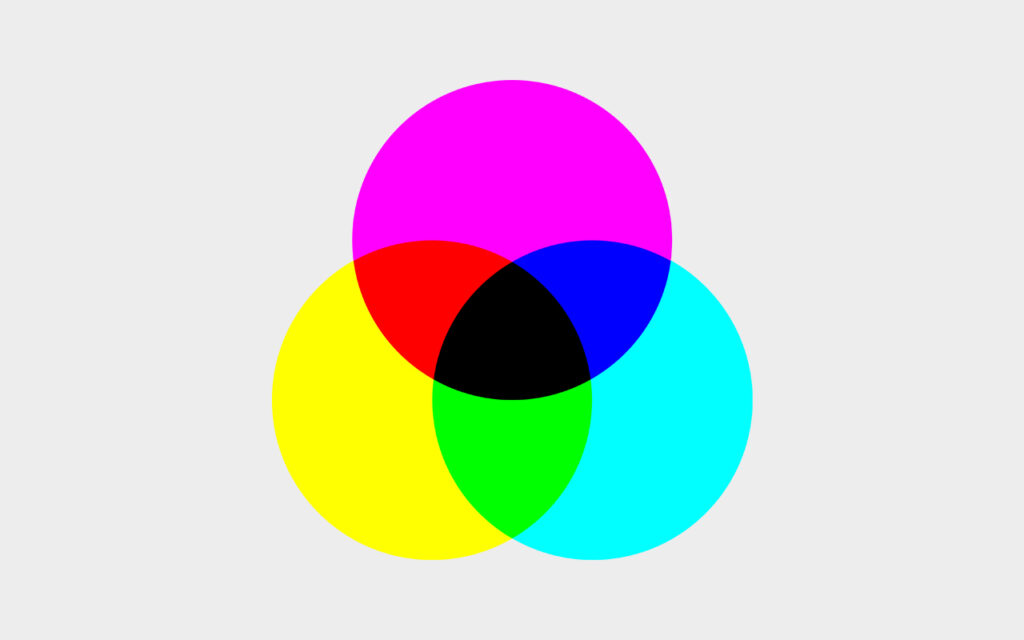
The second group of colors of white visible light are responsible for producing the colors by reflection. The color impression is thus created by mixing different intensities of turquoise, violet and yellow.
Let us adopt the diction of the image editor and henceforth speak of cyan instead of turquoise and of magenta instead of violet.
The subtractive color mixing process is characterized by the fact that a mixture of 100% cyan, 100% magenta and 100% yellow produces black. However, due to various shortcomings, such as pigment quality, the surface of the substrate, etc., pure black is never achieved in printing.
CMYK scheme

To remedy this problem, black is added as a fourth color in printing. Black has the task of supporting the depths. This is how the well-known four-color printing comes about. Printing dots of the four colors mentioned are applied to the paper next to each other in a specific screen and at specific screen angles. The color mixing is done by the human brain in the course of perception.
Four-color printing with the components cyan, magenta, yellow and black is therefore due to an inadequacy in the application of the subtractive color mixing process. Everyone who has a printer at his desk at home is familiar with four-color printing. Every printer is equipped with at least four different printer cartridges or toner cartridges, one for cyan, one for magenta, one for yellow and one for black.
In fact, four-color printing is the most commonly used color printing scheme of all. Almost all common printing processes – offset, digital printing, gravure, to name just a few – can handle 4c.
If you want to output your images accurately in four-color printing, you should first convert them to CMYK color mode in Photoshop. So our current RGB image has to be converted into a CMYK image for printing.
> Image / Mode / CMYK Color.
A look at the channels shows that the colors in our image are made up of cyan, magenta, yellow and black after separation – as the professional image editor calls the conversion to CMYK.
What we also have to take note of, however, is a sometimes strong color drop in some areas of the image. Especially the bright red and orange tones have clearly lost intensity, but the green of the boat has not been spared either.
Let’s select Toggle last State in the Edit menu to quickly switch between the current state and the previous state.
> Edit / Toggle last State and then several times in a row cmd-option+Z.
> Last CMYK.
The difference between the colors of the RGB image and the CMYK image is sometimes dramatic and by no means in favor of the CMYK image. Some colors seem unaffected by the separation, while others really dull out.
I always have to expect this kind of color drop when an image is transferred from RGB to CMYK, and there’s no way to prevent it. Of the 16.7 million colors in the RGB color space, only a fraction make it to paper in print. Let’s return to RGB.
> Cmd-option+Z (RGB).
It also does us no good if we do without the conversion to CMYK. The RGB colors are then preserved on the monitor, but printing is still done with CMYK colors. The preview of the expected color drop is omitted and the separation is completely left to the printer software.
Of course, RGB images can be printed as such on our desktop printers. But this has nothing to do with accurate color reproduction, even if the photo printer comes up with additional toners that expand the conventional CMYK color space.
On a professional level, RGB images that are used unseparated in four-color printing can cause far greater problems than merely surprising color reproduction. RGB data cannot be easily processed in the so-called prepress stage. It can happen that a color image appears black and white or not at all in the print result.
Sophisticated PDF workflows largely prevent such mishaps nowadays, but I wouldn’t rely on them.
The CMYK color space includes only those colors that can be printed, and their number is considerably smaller than the number of colors that can be shown on a display. We’ll look at this in more detail later when it comes to color management.
It is of eminent importance for the image editor who prepares images for print output to be able to see the images on the monitor as they will later come out of the press. Switching to CMYK mode is therefore obligatory for them.
However, in many cases you wait to convert to CMYK until it is actually time to create a print output file. In other words, the image remains in RGB mode in Photoshop Master for a long time and is usually only converted to CMYK at the end of image processing.
The reason for this is that nowadays, in addition to print output, another type of output is also important, namely output on a display. On the website, in the presentation via beamer or the display on the tablet, you want to make full use of the RGB color space.
Cross-media work, i.e. working for different output paths, is essential in our days.
If the image is to be prepared for both output paths, it is advisable to work in RGB mode, but to preview it in CMYK every now and then. Since the conversion to CMYK is associated with a defacto color drop, the image editor does not change the mode for this purpose, however, but simply brings up the so-called proof colors for viewing.
> View / Proof Colors.
The entry “RGB/8#/CMYK” in the title bar tells us the status of the image: it is still in RGB mode, but is displayed on the monitor in the manner of a preview as it would be expected in four-color printing.
Of course, to display the Proof Colors, use the shortcut cmd+Y. And with cmd+Y you also return to the RGB view.
> Deactivate Proof Colors.
> Enable View / Gamut Warning.
The Gamut Warning entry of the View menu can be used to mark all those colors in the image that are not printable. They are the ones in which the color falloff will be noticeable in print. Widespread, large, gray areas indicate that the color intensity will suffer greatly in the print result.
> Disable Gamut Warning (cmd-shift+Y).
However, things are never as bad as they seem. For us, who now switch back and forth between the RGB view and the CMYK view, the color drop is of course much more noticeable than in the print result itself, which is examined far from the RGB reference. We just must not expect – or give a client the expectation – that what we see in color on the monitor in RGB mode can be reproduced 1:1 on paper.
It is easy to see that especially highly saturated, brilliant colors will be affected by the color drop in the print result. This does not mean, however, that such colors cannot be reproduced on paper, but only that conventional four-color printing is not capable of doing so. Highly saturated, brilliant and other special colors are reproduced in so-called spot color printing. Spot color printing is a topic I will cover in the PSD Advanced Workshop.
At this point, I would like to mention that various HiEnd digital printing processes operate with significantly more extensive color spaces than the classic Euroscale CMYK. However, with higher print runs, this option is increasingly becoming a cost issue.
Grayscale
Let’s take a look at another color mode.
> Image / Mode / Grayscale.
Do we want to discard the color information? To get to the targeted mode in the fastest way, we probably have to.
However, note the reference to the Black & White setting option. The direct change to the grayscale mode provides a less exciting standard conversion. If you want to determine how the colors are converted into grayscale, you have to take the detour via Black & White. We will briefly deal with this at a later time.
> Discard.
Images can be reproduced not only in color, but also in black & white. Black & white photography was at the beginning of the development of photographic technologies, but has by no means disappeared with the advent of color photography. Nowadays, black and white is used as a stylistic device. One cannot deny the charm and specific expressiveness of black and white images.
What we commonly call black-and-white photography, however, should correctly be called grayscale photography. This is because we are dealing here with fine tonal gradations, i.e. with gray tones that make up the image.
To take a closer look, we zoom in quickly by pressing cmd+Plus several times.
> Several times cmd+Plus.
The pixels are indicated by different shades of gray. A look at the Channels palette even allows us to guess their number.
We have a single channel with a color depth of 8 bits and from this we conclude that in a grayscale image there are 256 different tone values that a pixel can take.
Bitmap
If you want to turn the image into a true black and white image, switch to Bitmap mode starting from Grayscale.
> Image / Mode / Bitmap.
The creation of a grayscale image is a prerequisite for switching to bitmap mode, there is no direct way from a color image to a bitmap.
We will only deal with the bitmap very briefly in the Basic Workshop, since its uses are very specific. However, I will go into more detail about bitmap generation in the Advanced workshop, when we will look at preparing images for screen printing.
So, without thinking about it further, let’s enter a value of 300 pixels/inch as the output resolution and choose Diffusion Dither from the Method menu.
> Output: 300 ppi, Method: Diffusion Dither and OK.
In a greatly enlarged view, you can clearly see that there are now only black and white pixels in our image. The 256 shades of gray have been reduced to the two extreme tonal values of black and white.
Let’s zoom out again to 50% display size by pressing cmd-Minus several times.
> Zoom out several times with cmd-Minus to 50% display size.
With only two tone values, smooth gradients are no longer possible in the image. In high resolution, these can at least be simulated with the Diffusion Dither method.
Finally, a question about the understanding of the term color depth. We heard …
- An RGB image has a total color depth of 24 bits/pixel.
This corresponds to 16.7 million colors. - A grayscale image has a color depth of 8 bits/pixel.
This corresponds to 256 tone values.
What color depth are we dealing with in a bitmap image?
A bitmap has a color depth of 1 bit/pixel, i.e. a pixel can have two different states, it can be black or white.
Let’s now return to the last saved version of our image by selecting the Revert entry in the File menu.
> File / Revert.
Color Management
Before we start with image editing, we need to take a quick look at the color management in Photoshop.
> Edit / Color Settings…
We set the essential parameters for the so-called color management in the Color Settings. Please don’t be impressed by the complexity of this dialog. We will make only a few, but basic settings here. An in-depth discussion of the implications of color management will naturally take place in the Photoshop Advanced Workshop.
The Color Settings are presets. Here we define the criteria by which our images should appear on the monitor. The aim is to ensure that we can see correctly at any point in the image processing, i.e. that the tonal values and colors are always displayed with regard to a specific output path.
Example: We have already talked about how important it is for the image processor to be able to see in advance on the monitor what print result is to be expected. Only under this condition can the measures in the image processing be set correctly.
If images are to be printed in four colors, for example, this basis can be obtained by activating the CMYK preview Proof Color in the meantime, or in any case by converting to CMYK mode.
The problem here is that CMYK is not equal to CMYK.
ICC profiles
The reproduction of tonal values and colors on paper depends essentially on the following parameters:
- Choice of printing process.
- Type of printing press.
- Choice of substrate.
The International Color Consortium and its associates have found a way to precisely define these parameters, and many more, and make them available in the form of so-called ICC profiles.
An ICC profile is a description of a specific color space. This color space contains all colors that can be reproduced in the intended printing process.
If an image is to be printed in a certain printing process, on a certain printing press, on a certain paper, the image editor usually simply obtains the corresponding ICC profile from the printer, implements it in her own workflow, and the image converted to CMYK is correctly displayed on the monitor with regard to the expected print result.
This is the basic idea of color management.
Of course, it is not practical to develop a separate ICC profile for each specific printing process. Therefore, in many cases, one operates with standard profiles. And that makes things a little easier for us again.
The Color Settings dialog provides a long list of common ICC profiles, i.e. CMYK color spaces, for selection.
> Open the Working Space / CMYK menu.
> Go to ISO coated v2 (ECI).
ISO coated v2 is one of the most common ICC profiles for offset and digital printing. The term coated indicates that this profile should be selected for displaying the image in CMYK mode when printing on coated paper. For most conventional print jobs, this is the case.
If I follow the printer’s recommendations and implement ISO coated v2 for processing the image in CMYK mode, and then embed the profile in the printable image file during the saving process, the printer guarantees me an accurate reproduction according to this standard.
The ICC profile therefore not only ensures that I can look ahead to the expected print result during image processing, but it also assures the print shop that it can print according to the ISO coated v2 standard.
This point also has legal implications:
- If, contrary to expectations, strong color deviations come to light in the print result, even though I as the image editor have used the ICC profile recommended by the print shop, the print shop must bear the costs for the botched print run.
- If I did not use an ICC profile or did not use the one recommended by the printer but embedded a different ICC profile in the image, the damage will be on me if the worst comes to the worst.
Of course, a number of other factors can be responsible for a botched print result. However, choosing the right ICC profile for the corresponding printing process is one of the immediate tasks of the image editor.
If there is any uncertainty on this point, it can be cleared up by a quick call to the print shop or by checking the print specifications that can be found on the print shop’s or a media owner’s homepage.
We leave the menu with the ICC profiles without selecting ISO coated v2. I will tell you the reason for this a little later.
RGB color spaces
Not only printing presses or reproduction processes operate with well-defined color spaces, but also monitors. For the correct display of images on certain monitors or in certain image reproduction processes, Photoshop’s Color Settings dialog provides numerous RGB color spaces to choose from. And even from this long list, we want to briefly highlight only a small section.
> Open the Working Space / RGB menu.
> Select sRGB IEC61966-2.1.
We already know the usage context of a very specific RGB color space. The well-known sRGB stands for a not too extensive RGB color space, which plays a role especially in web design.
As the mouse-over-description of the entry sRGB IEC61966-2.1 tells us, the sRGB offers a limited color space and does not form a reasonable starting point for converting RGB images to CMYK.
This statement seems somewhat cryptic, but it can be quickly illuminated if we consider how color spaces relate to each other.
Standard chromaticity diagram

The colorful shoe sole shows a schematic representation of the total color space accessible to human perception. The three contours drawn in tell us that specific color spaces are nothing more than certain sections of this total color space. BTW, another name for such a section is: gamut.
We notice that large segments of the sRGB color space (yellow contour), cannot be transferred directly into the CMYK color space (blue contour).
Another RGB color space, on the other hand, provides a much better starting point for the transfer to CMYK, namely the well-known Adobe RGB (1998) (purple contour). So we always prefer Adobe RGB and avoid sRGB if possible.
What do we learn from what we have just heard?
- Accurate display of RGB colors on the monitor also requires a specific color profile.
- Not all RGB is the same.
- A larger color space can be more easily converted into a smaller color space.
Above all, point three gives us the decisive hint for setting the Photoshop Color Settings. The directive is: Let’s assign the largest possible color space to our images at the beginning, in order to have an easy game in case of a possible reduction.
The Color Settings offer a very convenient and surprisingly simple solution for this:
> Settings / Europe Prepress 3.
The preset Europe Prepress 3 delivers the desired Adobe RGB (1998) as RGB Working Space and Coated FOGRA39 (ISO 12647-2:2004) as CMYK Working Space.
- Adobe RGB (1998) is a very large RGB color space. Most professional and semi-professional digital cameras produce Adobe RGBs.
- Coated FOGRA39 (ISO 12647-2:2004) is characterization data for a very large CMYK color space that can be reproduced in offset and digital printing. The already mentioned ICC profile ISO coated v2 (ECI), for example, was developed on the basis of this characterization data.
With this very simple measure, we have defined the Color Settings in Photoshop once and for all and will probably never have to consult this dialog again.
In fact, in the Color Settings we are only setting the broad framework for color management. The assignment of specific color profiles is done in a different way. And that’s where the Color Management Policies come in.
Color Management Policies
The Color Management Policies define how Photoshop should react when opening an image that has no color profile or a color profile that differs from my Color Settings.
You all know the annoying dialog that sometimes appears when opening an image.
> Cancel everything, close Bsp1 and open it again.
Setting the special color profile right when opening the image makes sense and should not be ignored, as we know now. The small dialog allows us to make the right choice quickly and easily.
Photoshop detects in our concrete example that no color profile is embedded and offers the following alternatives:
- We can do without color management, but this is not a good option for said reasons. After all, we want to see the image properly during processing.
- We can assign our working color space, defined once and for all in the Color Settings, in the course of opening. If we are about to open an RGB image, the entry Adobe RGB (1998) is logically offered here.
- Or we can choose a specific color space from the list of color profiles for displaying RGB colors on the monitor.
We decide to work in our preferred RGB color space and select Assign Working RGB.
Profile conversion
In case a color profile has to be embedded at a later stage of the image processing or an embedded profile has to be replaced by a different color profile, we resort to the Convert to Profile dialog.
> Edit / Convert to Profile.
> Profile menu and finally cancel.
Here we can select the color profile we need and convert our image to the desired color space.
Let’s return to the Color Settings again.
> Edit / Color Settings.
I think it has become clear by now why we have to deal with the very special seeming topic of color management even in a basic workshop. In order to see colors and tonal values correctly during image editing, correct color management is essential – in addition to other aspects such as monitor quality, monitor calibration, ambient light, etc.
We’ll look at this in more detail in the Photoshop for Advanced workshop.
Let me close this topic with one final note. Photoshop, as has been pointed out several times, is not a stand-alone solution, but part of a bundle of programs that cover desktop publishing.
In order to ensure consistent color management across the program boundaries, it is therefore advisable to also select Europe Prepress 3 in the Color Settings of Illustrator and InDesign. This is because, as we have already heard several times, the two output programs are intermediate stations on the way to printing for the image processed in Photoshop. The entry Synchronized and the closed circle symbol confirm that the color management of the three programs is synchronized.
> Cancel Color Settings.
And now we finally want to set the first image processing steps.
Selections
The topic that will occupy us in the following determines almost all areas of image processing. Image editing is unthinkable without making selections and thus, without mastering the essential techniques of selection creation.
Let us briefly consider why this is so.
Photoshop is a pixel-oriented program. And therein lies the challenge of making a selection. In Illustrator or InDesign, even in word-processing programs, elements can be activated almost effortlessly by simply clicking on them with the appropriate tool, in order to then be able to bring about a specific modification. A single click on a red circle is enough to make it receptive to the change of color into a blue circle. A double-click on a single word in the text structure is sufficient to select it for replacement by another word.
In Photoshop, however, elements do not exist in the traditional sense. Our image is an infinitely flat carpet of pixels containing areas of different color and tone values, but no objects that can be selected by simply clicking on them.
The ship in our image is therefore not accessible for processing as a ship or as a motif, but strictly speaking only as an image area. And this image area must be captured with the help of certain selection techniques, i.e. separated from all other areas that are not to be processed.
Area selection tools
Photoshop offers us a huge repertoire of different selection techniques. Among the simplest is the use of the area selection tools of the Toolbox.
We can’t and won’t look at every single tool in the toolbox in the Photoshop Basics workshop. So now and in the sequel, I will discuss only those tools that are indispensable in the everyday life of the image editor.
Rectangular Marquee Tool and Elliptical Marquee Tool
Let’s start with the Rectangular Marquee Tool and the Elliptical Marquee Tool.
> Press and hold the tool icon in the toolbox and expand the tool menu.
If we hold down the tool symbol of the Rectangular Marquee Tool in the toolbox, the tool menu expands. This means that the Rectangular Marquee Tool and the Elliptical Marquee Tool are in the same drawer of the toolbox.
Let’s grab the Rectangular Marquee Tool and try to create a selection of the red bucket with it. Let’s start by setting the Feather value in the tool’s options bar to 0 px.
> Activate Rectangular Marquee Tool; Feather: 0 px.
> Drag the selection in the area of the red bucket from the upper left to the lower right.
As soon as we take our finger off the mouse button, the selection process is finished and the selection boundary is marked by marching ants. All pixels inside the selection area are now accessible for editing, all pixels outside remain untouched by the following editing step.
> Fill area via option+backspace.
A quick colorization using option+backspace shows that unfortunately the Rectangular Marquee Tool will not allow us to adequately capture the bucket.
> Fill area canceled by cmd+Z.
Let’s use the Elliptical Marquee Tool to try again. Maybe we can get a better result with it.
> Activate Elliptical Marquee Tool.
To deselect the current selection, and thus clear the way for a new selection, just click somewhere outside the current selection in the image.
> Click outside the current selection.
The marching ants disappear. The selection is canceled. If I now pour color into the image, everything will be recolored.
> Fill area via option+backspace.
> Unfill area via cmd+Z.
Now let’s try to capture the bucket area as accurately as possible using the Elliptical Marquee tool. We can do this by starting to draw the selection at one of the four corners of the so-called circumscribed rectangle of the subject to be captured.
> Draw selection.
The created selection fits better than the one we had created with the Rectangular Marquee Tool, but the accuracy still leaves something to be desired. Even with the Elliptical Marquee Tools, we will not succeed in creating an accurate selection of the pixel patch we consider a bucket.
Before we pick up a tool that promises better success, let’s familiarize ourselves with a few basic operations of selection handling.
Selection operations
A selection can be grabbed by simply clicking on it using a selection tool, and moved around the image by dragging it.
> Move selection.
Only the selection area is moved, not its contents.
Let’s unselect the selection again. But this time by applying the shortcut cmd+D.
> Deselect with cmd+D.
This important, because constantly needed shortcut finds its reference in the entry Deselect of the Selection menu.
> Expand Selection menu.
The command Reselect shift-cmd+D activates the last deselected selection again.
> Activate selection again with shift-cmd+D.
Key shortcuts
Let me make a few comments about using key shortcuts at this point. Working with shortcuts speeds up the workflow. For this reason, which should not be neglected, we try to learn the most important key shortcuts right from the beginning.
The goal of the continuous use of shortcuts in the workshop is to activate the body memory. You all know the strange effect: If we are asked for a key shortcut, we often don’t remember it. Only when we grasp the shortcut on the keyboard does it come back to us. So the hand is supposed to remember the key shortcut in the end.
In the workshop, we use just the most important keyboard shortcuts. Take the opportunity to practice.
Keyboard commands should always be grasped with one hand only. The other hand always remains on the working device, be it a pen, the mouse or the touch pad. Conveniently, you’ll find the Cmd, Option, and Shift keystrokes on both sides of the keyboard.
And now for the selection operations.
If we want to add another selection to the existing one, we face the problem that the current selection will be deselected exactly when we start dragging the new selection.
To prevent the unintentional deselection of the first selection when adding a second selection, we press the Shift key during the selection operation.
> Add a second selection to the existing selection with Shift.
We now have two selection areas in the image, but they must be understood as a single selection. If I want to move one of the two, for example, this is not possible without moving the other.
> Move selection.
Now let’s cancel the current selection and create a new selection using the Elliptical Marquee tool.
> Cmd+D and create a new selection.
Just as we can add a second selection to an existing selection by pressing a keyboard command, it is possible to subtract any selection range from an existing selection by pressing a keyboard command. To subtract, we must hold down the Option key during the operation.
> Subtract a second selection from the existing selection by pressing Option.
Let’s undo the last operation by pressing cmd+Z and look at a third selection operation.
> Cmd+Z.
The intersection of two selections is also formed with the help of a special keyboard command. To do this, we hold down the Shift and Option keys during the operation.
> Intersection formation by option-shift+drag.
You may have noticed that the moment one of these three keyboard shortcuts is pressed for selection combination, there is a switch in the tool’s options bar in the row of selection buttons. The button corresponding to the keyboard command is temporarily activated there. If I press the Shift key, the Add to selection button appears highlighted, etc.
> Press Shift key.
So we could also create the selection combinations by pressing the buttons in the options bar of the selection tool. However, the path the cursor has to travel can be saved by using the corresponding keyboard shortcuts. In my options bar only the New selection button is highlighted.
> Unselect with cmd+D.
> Draw a new elliptical selection and hold it in hover.
How can we get the Elliptical Marquee tool to create an exact circle selection? When just dragging, we always get ellipses.
However, if we hold down the Shift key while dragging, the desired exact circle selection will form.
> Use Shift to create a circle selection.
And similarly, holding down the Shift key will cause the Rectangular Marquee tool to create a square selection instead of a rectangular selection.
If we want to add another selection to an existing selection and we want this second selection to be exactly circular, we are faced with a key conflict: Adding a selection and creating a circular selection both require pressing the Shift key. How is this to be accomplished?
We overcome the problem by applying a simple trick …
We press the Shift key before we drag the second selection to add the selection.
> Add a second selection to the existing selection with Shift.
While dragging, we now briefly release the Shift key and press it again to make the selection we are about to create an exact circular shape. The selection process now only needs to be completed in the usual way.
> Release Shift for a moment, press it again and finish the selection process.
Getting the task done is a matter of sequence and timing. You have to have done it at least once to know how it works. Please keep trying until you get it right.
Modify area selections
Let’s drag a new selection anywhere in the image using the Rectangular Marquee Tool.
> Activate Rectangular Marquee Tool, drag any selection.
> Open Select / Modify.
Once you have created a selection, you can modify it to achieve the actual selection goal. Behind the entry Modify of the Select menu there are a few possibilities to do this.
Let’s start with the entry Feather.
> Select Feather.
In the Feather Selection dialog, we can specify how much the selection edges should be softened by entering a pixel value. After all, we created our selection with hard edges. A look at the options bar confirms this. We had set the Feather value to 0 px.
Let’s now enter a high value for the soft edge in the dialog.
> Feather Radius: 30 pixels and OK.
Let’s observe by filling the area with color, what effect softening the selection edges has on the application.
> Fill area via option+backspace.
The color fill no longer breaks off abruptly at the line of the marching ants, but forms a soft transition in the border area. The ants march exactly in the middle of the fading zone.
> Fill area cancelled by cmd+Z.
The Modify entry Feather allows to soften hard selection edges afterwards. So the image editor does not necessarily have to select the Feather setting in the Options bar before making the selection. This has two advantages:
- Creating an area selection using a Selection tool is more precise.
- The soft edge effect can be tested at leisure by filling the area in the meantime.
> Unselect with cmd+D.
> Draw a new selection.
> Expand Select / Modify and select Border.
The entry Border allows to change the selection border itself into a selection area. The pixel value to be entered in the dialog determines the width of the resulting border selection.
> Width: 30 pixels and OK.
The area between the two lines of marching ants is now selected and can be edited separately from all other areas of the image. This is always helpful if only the subject border should be retouched.
> Unselect Fill Area by cmd+Z.
> Unselect by cmd+D.
> Draw new selection.
> Expand Select / Modify.
The entries Expand and Contract technically belong together. One does the opposite of the other.
> Select Expand.
> Expand by: 10 pixels and OK.
With Expand, the selection area is extended evenly to all sides by the entered pixel value.
Contract shrinks a selection area evenly from all sides by the entered pixel value.
> Select Select / Modify / Contract.
> Contract by: 10 pixels and OK.
The uniform expanding or shrinking of selections is especially important for image montage. The two commands help me to precisely determine the edge of the image motifs used.
We are currently still not able to create exact motif selections. This is because we have so far only resorted to the geometric area selection tools Rectangular Marquee Tool and Elliptical Marquee Tool. In practice, both tools are only used to create rough preselections or geometric selections.
The Lasso Tool, on the other hand, allows us to create a flexible area selection with simple means. Before we learn how to use the lasso, we need to quickly create a prerequisite for it.
Zooming and scrolling
When working with the lasso, it is usually advisable to move closer to the subject in order to be able to set the selection edges precisely. There is a whole range of tools and commands available for changing the size of the display, which we now need to familiarize ourselves with.
Navigating, as changing the zoom levels is called, is part of the absolute basic know-how in Photoshop. Using the different navigation techniques in a targeted manner speeds up the workflow immensely.
Zoom levels
> Expand View menu.
The two practical commands Zoom in and Zoom out are used for zooming in and out in steps. Of course, we do not select them in the View menu, but use the corresponding shortcuts cmd+Plus and cmd+Minus.
> Press cmd+Plus several times.
> Press cmd-Minus several times.
You always use one of the two commands if you want to change the size of the image as a whole without focusing on a specific zone.
> Open the View menu again.
Other menu items can be used to activate a few important zoom levels. Fit on Screen fits the image to the current window size. You always use Fit on Screen when the whole image should be displayed as large as possible. Because this zoom level is needed very often, you should quickly memorize the shortcut Cmd+0.
> Press Cmd+0.
The next frequently used zoom level is the 100% view. Also for 100% there is a shortcut that should be remembered: Cmd+1. Let’s use it right away.
> Cmd+1.
Display size 100% means nothing else than that the image is displayed according to the monitor resolution. In other words: Image resolution and monitor resolution are identical in the 100% view, i.e. there are now exactly 72 image pixels on one monitor inch. As you know, the monitor resolution has 72 pixels per inch.
So the 100% view offers the most accurate view of the image. You always choose this zoom level when you want to see what’s going on.
However, navigating with the zoom levels is only one side of the story. If you want to focus on a subject or a detail of the image, you have to use other means.
Zoom Tool
We find the Zoom Tool, i.e. the well-known magnifier, at the bottom of the toolbox.
> Activate Zoom Tool.
Interestingly, this constantly used zoom tool is hardly ever selected in the toolbox. This is because the image editor always uses the appropriate shortcut to activate the magnifier.
Before we use the tool for the first time, let’s take a quick look at the tool’s options bar.
- The button with the plus magnifier should be highlighted.
- The first two checkboxes Resize Windows to Fit and Zoom all Windows should be unchecked.
- Scrubby Zoom, on the other hand, proves to be extremely useful. In Scrubby Zoom mode, all you have to do is click the subject you want to zoom in on and drag it to the right while holding down the mouse button to bring it into view in the targeted section.
> Zoom in on the boat.
If I want to zoom out again afterwards, I usually choose one of the standard zoom levels or the Zoom out command, i.e. cmd+Minus. In fact, I can also do this with the magnifier itself, by clicking the subject again and this time dragging to the left while holding down the mouse button.
> Zoom out from the boat.
Since changing tools takes time, the image editor uses the key shortcut Cmd+Spacebar to activate the magnifier only temporarily for the duration of the zooming process at a time, without removing the current painting tool, selection tool or any other tool.
This also works by temporarily holding down the Z key.
> Fit on Screen via cmd+0
> Press the Z key shortcut and zoom in on the red bucket.
In detail view you are forced to scroll every now and then, i.e. to redefine the section. You can do this by scrolling the mouse or the touchpad. Photoshop also has its own tool for scrolling. If you press the spacebar without the additional key or the H key, the hand tool is quickly and temporarily available for scrolling.
> Press and hold the spacebar temporarily and adjust the bucket in the section.
> Hold down the H key temporarily and select a new detail.
By the way, a small advantage of the hand tool compared to the classic scrolling is its precise controllability.
Let’s apply the learned shortcuts again:
> Back to Fit on Screen via cmd+0.
> Zoom in on the red bucket via cmd+Spacebar and drag to the right.
> Release the keys and center the bucket in the window while holding down the spacebar.
Please note that during the whole navigation process no real tool change has taken place. The Lasso tool is still active and can be used immediately.
Lasso Tool
With the lasso we capture, as the name suggests, a part of the image. Its ease of use makes it a standard tool for quickly creating an accurate area selection.
If we hold down the lasso button of the toolbox, a menu pops up that gives us several different types of lasso to choose from. In addition to the classic lasso tool, we also find the so-called polygonal lasso tool and a magnetic lasso tool here. Basically, we are only interested in the classic lasso tool and the polygonal lasso tool.
Let’s start with the classic lasso.
> Activate Lasso Tool.
We start at any starting point – I personally always choose a prominent point of the outline of the subject we want to select – and go around the zone we want to capture, holding down the mouse button and without dropping it.
> Go around the bucket with the lasso, making two small protrusions, one inwards, one outwards, in the boundary line.
> Close the selection.
We close the selection process by releasing the mouse button near the starting point of the circumnavigation.
Important to know: Photoshop closes the selection process in any case as soon as we release the mouse button. If we take the finger off the button too soon, or if the cursor position is awkward, Photoshop will close the selection with a straight line of marching ants, which may then run through the subject, indicating that part of the subject is outside the selection.
I think it became immediately clear from this simple task what the difficulty is in working with the lasso: The fact that you have to create the selection, without being able to set it down in the meantime, in a single pass can bring drops of sweat to your brow. A steady hand is required and it is advisable to hold your breath. In more complex selection tasks, therefore, you soon reach insurmountable limits with the lasso.
Imagine you have to select the oak tree in the field with its 2 million leaves in this way. The amount of work and complexity would be enormous.
Furthermore, we have to state that it will hardly be possible to create exact area selections with the lasso in freehand mode. In fact, the Lasso is a tool that – like the two Marquee tools already discussed – is usually only used to make rough preliminary selections.
However, this in no way diminishes its importance: Lasso is one of the most frequently used selection tools of all.
The selection we have just created is anything but perfect. But we don’t have to be satisfied with it. We can improve the selection, and the Lasso tool itself is quite suitable for this purpose.
We remember the keyboard shortcuts for Add to Selection and for Subtract from Selection. What worked with the Marquee Tools also works with the Lasso: we add missing parts to the selection by holding down the Shift key and remove unneeded areas from the selection by holding down the Option key.
Please pay attention to my procedure: I start by moving the subject outline along the appropriate spot and then go around the missing or excess piece in a wide arc before taking my finger off the mouse button to let the selection close.
> Add selection by Shift-Lasso.
> Subtract selection by Option-Lasso.
> Further enhance area selection by applying Shift-Lasso and Option-Lasso.
Little by little, we are approaching a satisfactory selection. Nevertheless: It remains in any case a laborious undertaking.
Basically, we should strive to achieve an acceptable selection result right from the start. Photoshop has a way to make this easier when working with the lasso. Let’s deselect the current selection and try the whole thing again using a little trick.
> Unselect cmd+D.
Please pay attention to my procedure: I click a starting point with the classic Lasso Tool and then press the Option key. As soon as I hold down the Option key, I can release the mouse button.
> Click the starting point, press the Option key and keep it pressed.
If I now move the mouse, I see that the cursor remains connected to the starting point by a kind of rubber band. Now I click, a bit away from the starting point, a second point at the contour of the subject. Then a third point, a fourth point and so on.
> Click a few more points.
The so-called polygon effect allows, instead of having to draw freehand, to create the selection boundary by clicking points. I can go around the subject at my leisure this way and position the selection accurately. As long as I hold down the Option key, this special selection mode is upright. No trembling of the hand and no bated breath drive me to hurry.
If I want to draw one or the other curve piece myself in between, this is not at all denied to me in the polygon mode.
> Draw a small curve freehand.
> Click more selection points.
At the very end I release the Option key and the mouse button and Photoshop closes the selection as usual.
> Complete the selection.
Polygonal Lasso Tool
Some of you may ask why we don’t use the Polygonal Lasso Tool, which has this polygonal effect right from the start, i.e. the polygonal effect is available without pressing the Option key.
My first argument for using the Classic Lasso Tool instead of the Polygonal Lasso Tool is a very personal one: The Classic Lasso Tool has grown into my hand, because it is the older one. The Polygonal Lasso Tool was not added to the tool set until sometime in the noughties.
In fact, the two lasso variants are only the opposite approach in handling. Both can do the same thing, just in reverse order.
- If you want to use the polygonal effect with the classic lasso tool, you have to press the Option key.
- If you want to use the Polygonal Lasso Tool to draw curves in the style of the classic Lasso Tool, you also have to press the Option key.
> Unselect cmd+D.
> Activate Polygonal Lasso Tool.
> Click start point and a few more points.
> Press Option key and draw a short curve freehand.
Two small features of the Polygonal Lasso Tool I would like to mention:
- When using the Polygonal Lasso Tool, the selection process must be terminated by clicking the starting point again or by double-clicking. I save myself this little inconvenience when I work with the classic lasso.
- A small advantage of the polygonal lasso tool compared to the classic lasso is the possibility to cancel the clicks individually by pressing the delete key. So you can make corrections to the selection already during the selection process.
> Undo one or two clicks by pressing Backspace.
> Complete the selection and close it by clicking in the starting point.
Basically, it doesn’t matter which of the two tools you choose in your personal workflow. My recommendation is to try both tools, make a choice, and then stick with it.
Magnetic Lasso Tool
I will only mention the third lasso variant in the Lasso Toolbox in passing, because it has no relevance for me in practice.
The Magnetic Lasso Tool promises quick work by a small assistance. If you move the cursor along a subject outline, the magnetic lasso recognizes it as such and Photoshop creates the selection boundary at the right place.
> Activate Magnetic Lasso Tool.
> Selection creation bucket.
> Close the selection by clicking again in the starting point.
However, this promise can be kept only in the rarest cases. The semi-automatic process aims at tonal and color contrast at the subject border. Where contrast is too low, the Magnetic Lasso Tool fails miserably. The contrasts in the contour area of a subject are rarely so pronounced and so precisely given that one could achieve usable results with the Magnetic Lasso Tool right away.
Adjusting the Width, Contrast, and Frequency settings in the tool’s Options bar may improve the results, but it slows down the workflow considerably.
Let’s deselect and now strive to create a perfect area selection of the bucket using the Lasso tool. Whether you rely on the classic tool for this or use the polygonal lasso is up to you.
By pressing the Caps Lock key, we temporarily turn the cursor icon into a crosshair. The crosshair makes it easier to position the selection points exactly.
> Unselect cmd+D.
> Activate Caps lock.
> Click start point, press and hold Option key, create selection using the Create polygon effect.
> Deactivate Caps lock.
After the selection creation is finished, we deactivate caps lock again. The cursor symbol of the lasso is visible again.
Save selection
Selections that have been created with a great deal of effort, and which one assumes will be needed again at a later time, should be saved. We do this by selecting the Save Selection entry of the Select menu.
> Select / Save Selection.
> Document: File Name; Channel: New; Name: „Bucket_L“
In the Save Selection dialog we determine the location where the selection will be saved and assign a meaningful name to it.
- We specify that the selection is saved directly to our document.
- We save the selection as a new channel.
- We give the saved selection a name that is as coherent as possible. I call it „Bucket_L“ to indicate that the selection was created using the Lasso tool.
The reason for naming the selection technique is purely didactic: we will create more bucket selections in the course of the workshop using other selection techniques, so that we can compare them with each other.
Let me also clarify right away that Save Selection is only one of several options to keep selections for later use. So in practice we will not save every selection we want to keep this way.
> Save Selection: OK.
A look at the Channels palette reveals the location and tells us what form the selection was saved in. A new channel has been added to the known color channels, with the name we just gave it. So our selection is stored in the form of a channel, more precisely as an alpha channel.
Some of you may have already heard about the mysterious alpha channels. Now it reveals that with alpha channels we are primarily dealing with stored selections. Since we’ll be taking a closer look at alpha channels later in the workshop, I’ll leave it at that for now.
Let’s recap: We had created a selection and then saved it in the document as an alpha channel. If we still want to be able to access the selection two weeks or three months from now, we still have one important thing to do, and that is to save the document itself.
We do this, of course, by using the keyboard shortcut cmd+S.
> Save by cmd+S.
The saved selection in the backhand we can deselect the current selection without any danger. After all, we can reactivate it at any time. Let’s try this right now.
> Cancel selection with cmd+D.
We take a look at the Select menu and notice that the previously grayed out Load Selection entry is now accessible and select it immediately.
> Select / Load Selection.
In the Load Selection dialog, we primarily determine which of the saved selections we want to reactivate. Since we have only one selection saved at the moment, it is already preset. So we don’t have to make any settings here at the moment, we can just give OK.
> Load Selection: OK.
The selection has been loaded and is active again.
Before we take a look at another important area selection tool, I would like to introduce you to a shortcut that belongs to the indispensable set of selection key shortcuts: Command+H.
In true unmissable fashion, the marching ants mark the selection edges. However, if you want to examine the border area of the motif undisturbed, it is advisable to hide the ants, and we accomplish this by applying Command+H.
> Hide selection by cmd+H.
Strictly speaking, Command+H hides other extras besides the marching ants. Let’s have a closer look in the view menu.
> Expand View menu.
In the line below the entry Extras the Show menu can be expanded.
> Expand Show menu.
You see, Selection Edges, is just one extra among many that can be displayed. Grids, Guides, Slices, and more, are all display aids designed to clarify certain aspects for image editing. Command+H hides all these aids and also shows them again.
> Press Command+H repeatedly.
> Hide last selection.
> Fit on Screen by cmd+0.
The following step is intended to illustrate the consequences we may have to reckon with if the selection edges are hidden.
> Select a brush with a small, round tip.
> Try to paint away from the bucket.
The painting tool is obviously not doing what it is supposed to do, namely paint. This is not because I have made the wrong settings for the tool, but simply because the areas where I want to use the tool are protected from paint application. This is because the targeted areas are outside the invisible, but still active selection of the bucket in the image. Clearly, painting can only work within the selection.
> Painting inside the hidden selection.
In the heat of the moment I just forgot that there is an active selection hidden somewhere in the image. In fact, it happens from time to time even to experienced image editors that they forget about a hidden selection.
The cause of this problem can be easily identified by pressing Command+H. If ants start marching somewhere in the image, the problem is clear.
> Show selection by cmd+H.
In the image processing practice one is confronted with problems of this kind from time to time. Forgetting a hidden selection is one of them. You try to get to the bottom of the problem as soon as possible and therefore work through a small checklist for troubleshooting.
The first entry on this checklist for troubleshooting is: Is there a hidden selection somewhere in the image?
In the course of the workshop, we will get to know more entries of the checklist for quick troubleshooting. But more on that later.
I’d like to quickly introduce you to two other area selection tools that can produce quite useful results under certain conditions: the Object Selection Tool and the Quick Selection Tool.
Both tools can be found in the toolbox just below the Lasso Tools. Let’s start with the Object Selection Tool.
Object Selection Tool
> Open the Tool menu.
> Activate Object Selection Tool.
When the Object Selection Tool is activated in the toolbox, the Object Finder begins searching for possible objects in the image. This only happens, of course, if the corresponding checkbox is activated in the small options menu. After the search is completed, the objects found are highlighted in color on mouse-over. A click on an object is enough to create the area selection.
> Click on the bucket, activate selection.
Let’s save the selection in the usual way and call it “Eimerchen_O”.
> Select / Save Selection: Eimerchen_O.
If you press the Show all objects button, Photoshop will show all object selections.
> Press the Show all objects button.
> Deactivate Show all objects and deselect.
If the AI working in the background does not deliver usable results, the process can also be triggered manually. The small Mode menu allows us to choose between Lasso mode and Rectangular mode. By choosing the mode we determine with which tool routine the Object Selection Tool can be used.
> Open the Mode menu: Activate Lasso mode.
Sample all Layers should of course only be switched on if different parts of the object to be selected are distributed over several layers.
The Hard Edge checkbox improves the selection in the edge area of motifs with hard contours.
Although we have chosen the Lasso mode for the application of the Object Selection Tool, the procedure of selection creation is quite different from that of the normal Lasso tool. We don’t have to draw an exact selection along the outline of the subject at all, it’s enough to go around the subject generously.
> Select the rake generously with the Object Selection Tool.
> Improve selection by adding with Shift or removing with Option.
Even when using the Object Selection Tool manually, there is an AI-assisted motif recognition. And in many cases this works quite flawlessly. The prerequisite for this is, of course, that the required edge contrast is present to a minimum degree and that a motif is recognizable as such at all.
Quick Selection Tool
When using the Quick Selection Tool, the selection is also made by AI, which targets the edge contrast of a pixel zone. However, the tool is used in a completely different way.
> Open the Tool menu.
> Activate Quick Selection Tool.
So that we all achieve a similar result, we make the following settings in the options bar without thinking about it in detail:
> Options Bar: Add to Selection; Brush Size 50px, Hardness 0%, Spacing 25%, Activate the Enhance Edge checkbox.
With the Quick Selection Tool we work like with a painting tool. However, no paint is applied, but a selection is brushed quickly and conveniently. We paint out a pixel zone and Photoshop completes the selection to the limits of the subject.
> Select the bucket with the Quick Selection Tool.
With the Option key held down, the tool can be used to subtract overshooting selection areas. Holding down the Shift key adds missing areas to the selection.
> Improve Selection.
We also want to save this selection for the comparison we will make later.
> Select / Save Selection: „Bucket_Q“.
> Cmd+S.
The Object Selection Tool and the Quick Selection Tool both work semi-automatically, so to speak, and thus allow you to work quickly. However, we will not always succeed in creating selections as well as with the bucket. Everything stands and falls with the contrast of the subject contour and the basic recognizability of a subject. If both are given to a sufficient degree: top, if not: flop.
So much for the simple area selection tools of the toolbox. Let me close the topic with two hints:
In the option bars of the area selection tools we find a button called Select and Mask. Behind it is an extensive dialog for area selection creation and enhancement. A discussion of it would go beyond the scope of the Basics Workshop. But we will look at it in detail in the Advanced Workshop.
> Options bar: Press Select and Mask.
> Cancel.
We have seen some very different and some very similar area selection tools. You might think that Photoshop offers too much of a good thing. But this is not the case. The apparent redundancies in the program environment are an almost typical characteristic of Photoshop and for the most part completely justified. The reason for this is to be found in the diversity of the image processing material itself, i.e. in the infinite variety of images. We will encounter the seemingly redundant scheme in many other areas of the program. Learning to choose the right tool for the particular application is the first major goal of our workshop.
Color selection tools
Besides image areas to select, there are other selection targets. The goal is not always to capture a pixel area. In the run-up to coloring, for example, you’re often just aiming for a color to be changed.
So now let’s familiarize ourselves with a few color selection techniques, or more precisely, color range selection techniques. Let’s open Exercise 2.
> Exercise file 2
Magic Wand Tool
A simple color range selection tool Photoshop puts in our hands is the Magic Wand Tool. We find the Magic Wand Tool in the same drawer as the Object Selection Tool and the Quick Selection Tool.
> Activate Magic Wand Tool.
Unlike these two tools, which use the color contrast in the border area of a subject to create an area selection, the Magic Wand Tool is a pure color selection tool.
Let’s apply it right away by selecting the red tones of the apple at the front left. We start with a click in a middle red tone.
> Click medium red with the magic wand.
The ants start marching in a somewhat chaotic fashion. The only thing I can tell from the selection edges is that I certainly didn’t get all the reds in the apple. Furthermore, we have to state that the selections of each of us turned out completely different. There are two reasons for this:
- We certainly did not click the same pixel.
- We neglected to take a look at the tool’s options bar.
The Magic Wand Tool is not easy to use. Before using it, we need to make a few settings in the options bar.
By choosing a Sample Size, we set the size of the pixel zone that Photoshop will use as a reference for the color comparison.
> Options bar: Expand Sample Size menu.
> Select Last 3 by 3 Average.
- Point Sample means Photoshop uses only the clicked pixel as a color reference for selection creation.
- 3 by 3 Average means Photoshop uses the average value of an area of 3 by 3 pixels as the color reference for selection creation, and so on.
Choosing 3 by 3 Average usually provides a quite useful color reference value.
The most important measure for using the Magic Wand tool is to set a tolerance value. With the help of the tolerance we determine how tolerant Photoshop is when judging color deviations with respect to the reference value.
Photoshop only includes pixels in the color selection whose color is sufficiently similar to the reference color.
- A low tolerance value ensures that the color values of the pixels in question may only deviate slightly from the determined color reference value in order to be included in the selection.
- The higher the tolerance value entered, the more leniently Photoshop behaves with regard to color deviations.
The first step in using the Magic Wand tool is to define a suitable tolerance value. A certain experience in using the tool, but also the principle of trial and error will usually lead you quickly to your goal.
> Options bar: Enter tolerance value 50.
- The checkbox Anti-alias should always be on. The anti-alias effect smoothes the selection edges.
- And also Contiguous is useful in most cases. Contiguous ensures that only adjacent pixels are included in the selection.
In our example, we use it to specify that only the reds of the one apple, and not all the apples in the image, are added to the selection.
Let’s temporarily uncheck the Contiguous checkbox to see the difference.
> Options bar: Disable Contiguous.
> Unselect with cmd+D.
> Unselect with cmd+D.
> Activate Contiguous again.
Let’s click again in a middle red tone of the front left apple and create a good starting point for completing the color selection.
> Click the middle red tone of the apple with the Magic Wand Tool again.
To add further color selections to the existing selection, we can use the already known Add Selection function. A click with the Shift key held down in a red area that has obviously not yet been included expands the color selection range. By using it several times, the selection result can be completed bit by bit.
> Extend color range selection by three shift-clicks for the time being.
Adding by shift-clicks contains a certain imponderability that cannot always be mastered. The success depends strongly on the pixels clicked in each case. Selecting a uniform color range in this way often proves difficult.
Grow
An alternative approach for expanding the color selection range can be found in the Grow entry of the Select menu. Let’s try this out right now.
> Unselect with cmd+D.
> Click the middle red tone of the apple with the Magic Wand Tool.
> Select / Grow.
Grow causes an even expansion of the color selection range. The amount of expansion depends on the tolerance value set for the Magic Wand Tool. Grow therefore reacts with the same sensitivity as the current Magic Wand Tool.
The Grow command can also be applied several times in succession.
> Select / Grow again.
The targeted color range selection can be achieved in many cases by cleverly combining the capabilities of the Magic Wand tool and the Grow command.
> Improve color range selection by one or two Shift-clicks.
But can we be satisfied with the result? Let’s do a quick color fill as a test to check that all the reds in the apple are indeed selected.
> Fill area via option+backspace.
The test fill shows that not all red tones of the apple were captured. Especially the scattered reddish pixels in the green area of the apple were not hit.
> Cmd+Z.
How can we still add the missing color areas to our selection?
Shift-clicking is out of the question: we would have to click dozens of times without being sure to hit the right pixels.
Unfortunately, since the reds of the apple do not form a closed zone, but are partly scattered and not adjacent, we will not be able to reach the selection target even with the Grow command.
Let’s keep the selection goal in mind again: We want to select all red tones of the apple lying in front on the left.
We achieve our goal by dividing the task into two steps.
In the first step, we create an ordinary area selection for the apple. I’ll grab the Object Selection Tool to do this. Since we want to keep the area selection only in the backhand for the time being, we first save it as an alpha channel.
> Select apple using the Object Selection Tool in lasso mode.
> Select / Save selection: „Apple“.
> Deselect via cmd+D.
The second step is to capture all reds, not just adjacent ones. We use the Magic Wand Tool with the Contiguous checkbox deactivated.
> Activate Magic Wand Tool; Options bar: Deactivate Contiguous checkbox.
> Select medium red tones in the entire image by clicking on them.
As expected, not only the corresponding red tones of the apple were selected, but similar red tones in the entire image.
Similar
Using the Similar command of the Select menu, we can add more similar colored areas to the current color selection.
> Select / Similar 2x.
Like the Grow command, the Similar command recurses to the current tolerance value of the Magic Wand tool. And like the Grow command, the extension is absolutely uniform. However, unlike the Grow command, the Similar command does not take into account whether pixels are adjacent.
Finally, we enlarge the color selection thus obtained, if necessary, by a few shift-clicks into the strongly deviating red tones of the apple that have not yet been captured. In doing so, we are not at all bothered by the fact that the color selection thereby also grows in other image areas.
> Complete the color selection with one or two shift-clicks.
As soon as the marching ants suggest that all the targeted red tones have been captured, it’s time to restrict the color selection to the area of the apple lying in front on the left. And now the saved apple selection comes into play.
> Open Select / Load Selection, Channels: „Apple“.
The Operation panel of the dialog holds a number of entries, including those that promise to combine the current color selection with the saved area selection.
We decide to use Intersect with Selection, i.e. to create the intersection of the two selections.
> Activate Intersect with Selection and OK.
In addition to a technique for creating a color range selection, this example teaches us something essential that applies to selection creation in Photoshop in general: achieving a selection goal often requires several steps that must be done successively. Often we have to take a little detour to get to the goal. And furthermore: Different selection techniques can be combined with each other. Finding intelligent ways and combinations here is one of the most important skills of the image editor.
> Deselect via cmd+D.
We could also achieve this two-step selection creation in a faster way. To do this, we start with the global color selection using the Magic Wand Tool in combination with the Similar command. Once all the desired color areas have been captured, we restrict the selection to the apple zone by forming the intersection between the global color selection and an area selection created with the Object Selection Tool.
> Activate the Magic Wand Tool; deactivate the Contiguous check box in the options bar.
> Select the medium red tones in the entire image with one click.
> Select / Similar 2x.
> Complete the color range selection with one or two shift clicks.
> Activate the Object Selection Tool and create the intersection between the apple area and the global color selection with an option-shift-click.
The apple zone has turned into a swarming anthill. We trust that the desired color range selection has been made precisely. But is this confidence justified? Can we be sure that we have taken the right steps in the procedure we have just outlined?
What the Magic Wand Tool and the Grow and Similar commands unfortunately lack is anything like a visual control.